UX Design (WEB) | COURSE PROJECT
Cryptocurrency Dashboard Redesign
Collaborators
Kavya Iyer
Eugene Kim
Michelle Liu
Olivia Xu
Timeline
4 weeks
Skills
Interaction Design
Visual Design
Tools
Figma
What I Worked On
As a student in Interaction Design Overview at Carnegie Mellon University, our group was tasked with identifying an appropriate primary user to design for and creating a targeted interaction that modifies an existing product to support the primary user. Our given topic was overly confusing complex systems, so we chose to focus on crypto platform designs.
Problem
New cryptocurrency users often need to go out of their way to learn about crypto, which often leads to giving up on using cryptocurrency platforms.
Solution
Add a “Beginner Mode” feature to the existing interface that can be toggled on and off to make crypto platforms more equitable for beginners.
Design Process
Research +
Synthesis
Ecosystem Collection Map
Interviews
Affinity Diagram
Brainstorming
+ Creating
Storyboards
Lo-fi wirefames
Lo-fi prototype
Mid-fi wireframes
Validation +
Revisions
User Testing
Hi-fi wireframes
Research + Synthesis
Ecosystem Collection Map
Creating this map allowed us to identify the issues with a complex system, such as a crypto platform, as well as who these issues were harming.
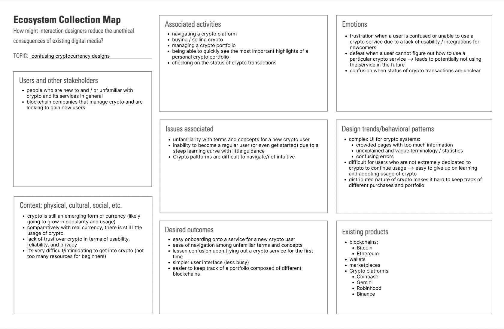
Key findings:
Many crypto platforms, such as Coinbase, require a lot of onboarding for a new user.
Crowded pages with too much information
Unexplained and vague terminology / statistics
Research direction + plan:
Target first-time users or users with limited crypto knowledge on Coinbase and use research to guide us in
identifying which interaction to modify to best help such users onboard more easily
Interviews - Primary Research
We interviewed multiple beginners in the cryptocurrency space to understand the pain points they experience and discover any unmet needs.
“I tried to consult various online resources about crypto, but I found most of them confusing so I stopped trying to learn about it.”
"It took a decent amount of time to research everything about crypto when I was new to it."
"It would have helped me a lot if there was a go-to place where I could've learned what crypto really is when using crypto platforms for the first time."
Common theme: new crypto users need to go out of their way to learn about crypto and this often leads to
giving up on using crypto platforms
Affinity Diagram
We then used affinity diagramming as a technique to discover themes and underlying needs from our research findings.
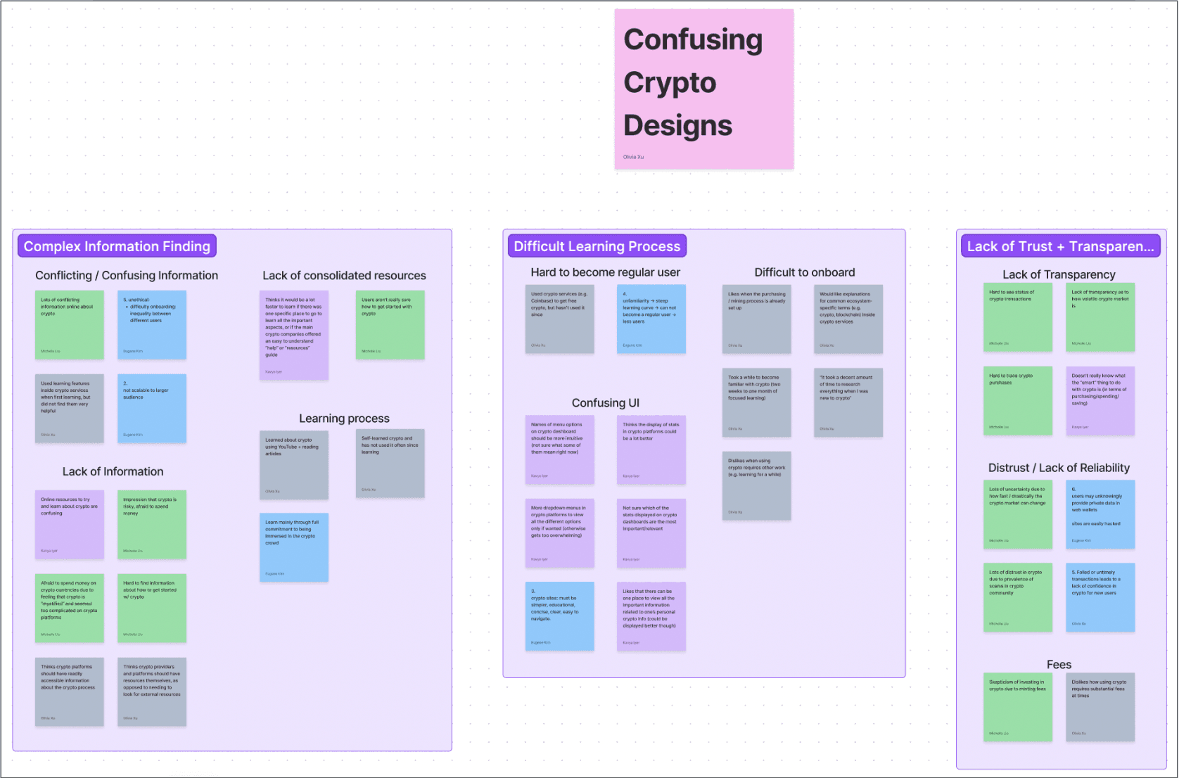
Key themes:
Complex information finding
Difficult learning process
Lack of trusts + transparency
Pain points identified:
Barriers to entry: lack of information on domain terminology
Breakthrough: those very interested in crypto have to spend a substantial amount of time learning to
understand a crypto platform → even more difficult for users with limited interest to onboard.
Brainstorming + Creating
Storyboards
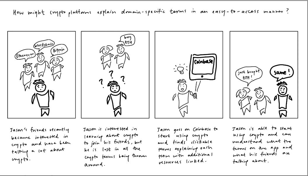
Our goal was to reframe a single pain point from our research to drive different solutions. The pain point we chose to focus on was that confusing domain terminology within crypto platforms make them difficult to use for beginners. We generated several "how might we" questions as a teambased off this pain point.
One of our questions:
"How might we explain crypto terms in an easy-to-access manner?"
We then each individually crafted scenarios to think through new solutions to improve our primary user’s experience when using a crypto platform in order to promote empathy within the system. In creating my scenario, I focused on capturing the primary user's problem, the actions taken, the reaction of others, and the results from taking action.
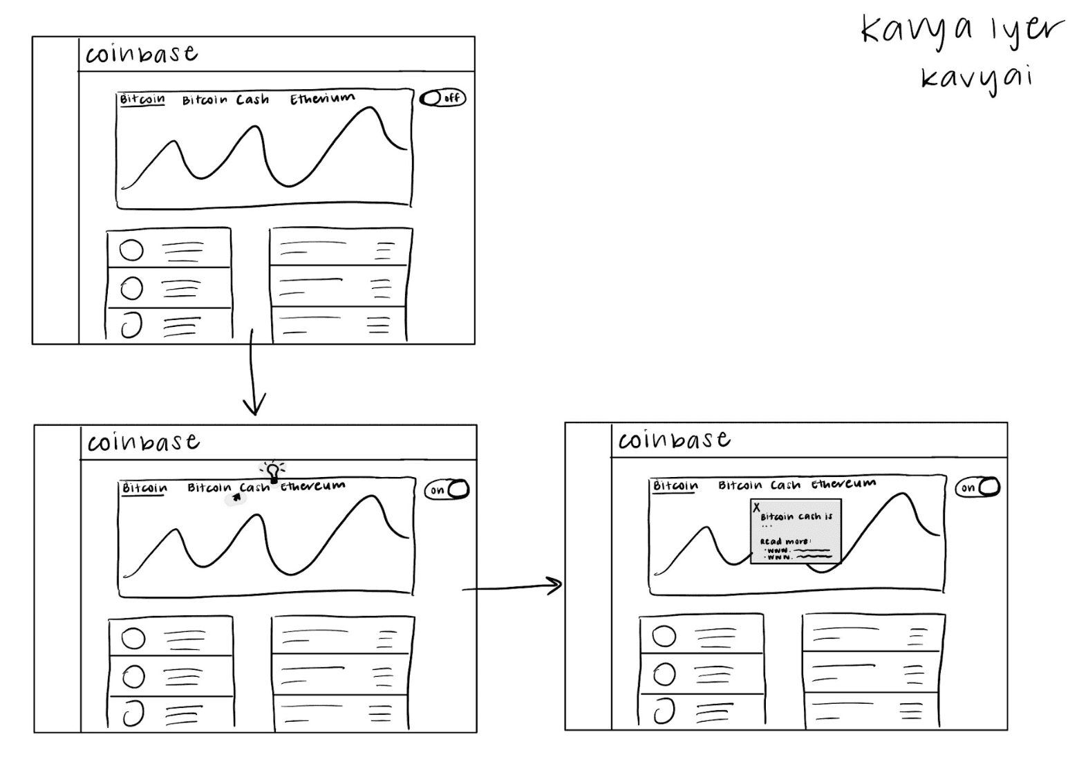
Kavya's Example:
“Ana downloaded Coinbase when she first got interested in crypto, but with a time-intensive job, she did not explore it much. However, she just got time off for the holidays, so she revisits Coinbase and sees new terms. When she hovers over a term, she sees that it can be clicked, pulling up an explanation. Conveniently, the pop-up also lists some external links for users that want to get more in-depth knowledge. Encouraged by the wealth of resources available to her on Coinbase, Ana is motivated to continue using it throughout the break.”
Each team member then chose a single scenario one of their scenarios and created multiple storyboards for that one scenarios. My focus was on having distinctions between each storyboard with regard to the implementation of the scenario. I wanted to illustrate the goal of the primary user and what purpose the product has been designed to support, rather than the actual interface of the solution.
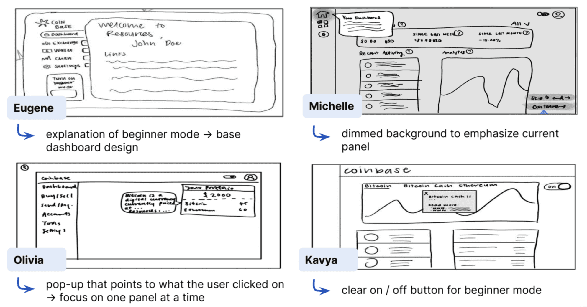
Lo-Fi Wireframes
After reviewing our individual storyboards as a team, we selected our screen-based interaction as being a
hover interaction over domain-specific terms within the crypto platform, with the aim of targeting unexplained crypto terminology that the platform uses. Each team member created a wireframe; focused on quick and loose sketches at this stage.
As a team, we then selected aspects from each individual wireframe to create a stronger group lo-fi wireframe.
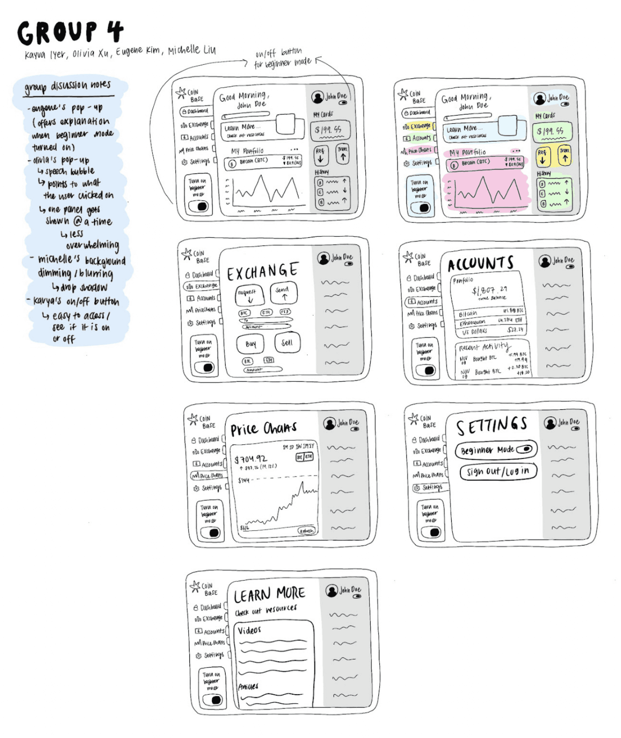
Lo-Fi Prototype
Our next step was to take these designs and create lo-fi prototype in Figma, a process I led. We focused on adding real content, functionality, and enough detail so that a user could actually imagine what the design does and how it would help them.
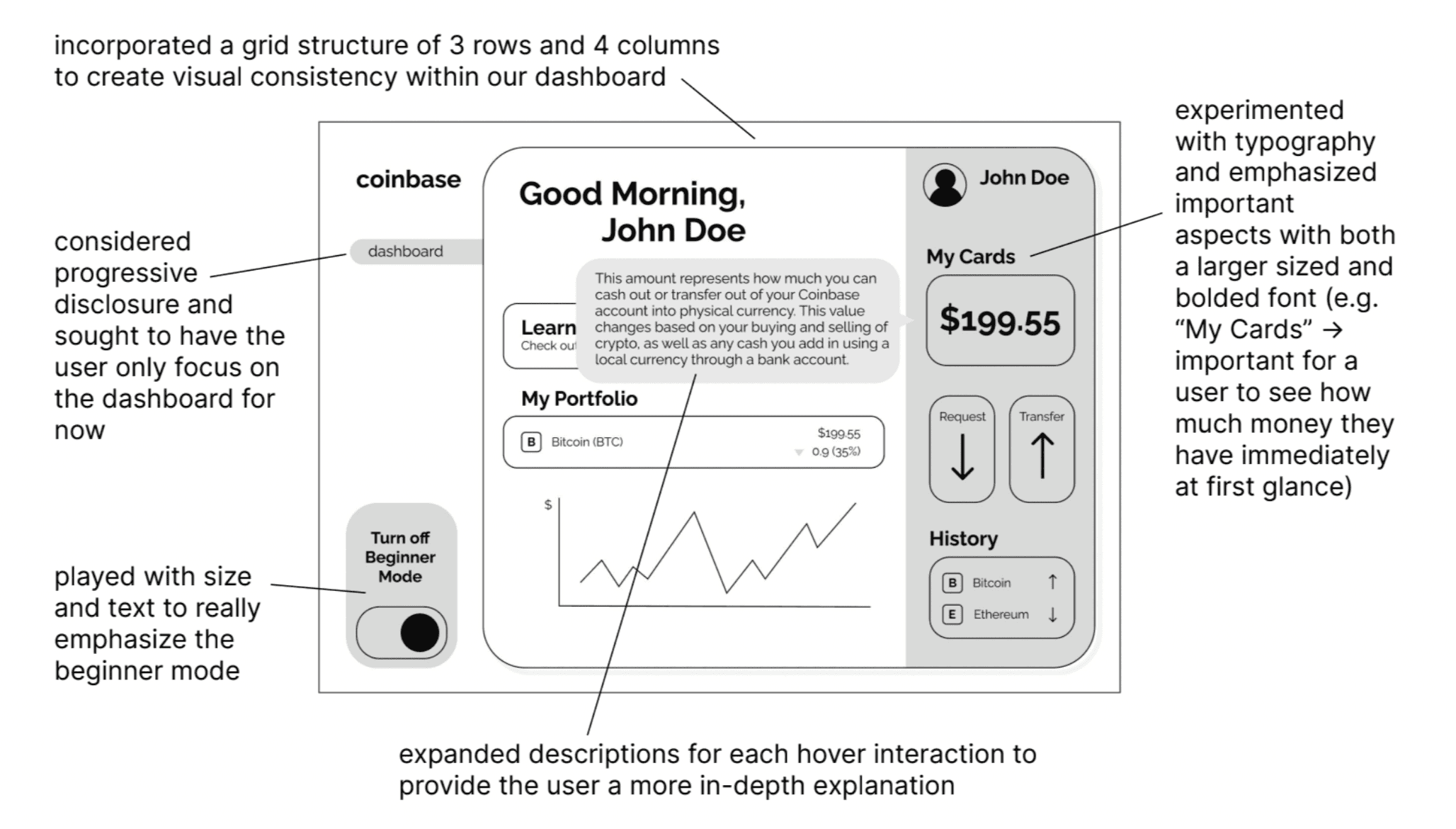
Mid-Fi Prototype
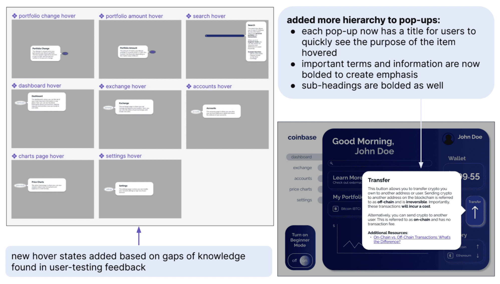
From our previous prototype, we moved forward by focusing on interactivity and making some refinements . Since we were modifying an existing platform (i.e. Coinbase), we sought to emulate the existing dashboard design and to build our hover interaction on top of that. I led a team discussion to prioritize specific interactions and design choices
Some of our key design decisions were as follows:
Content:
Created a search bar, so that users can easily search for information within the website → catered to beginners who do not know where everything is yet
Added all the menu items on the left side to increase the realism of prototype
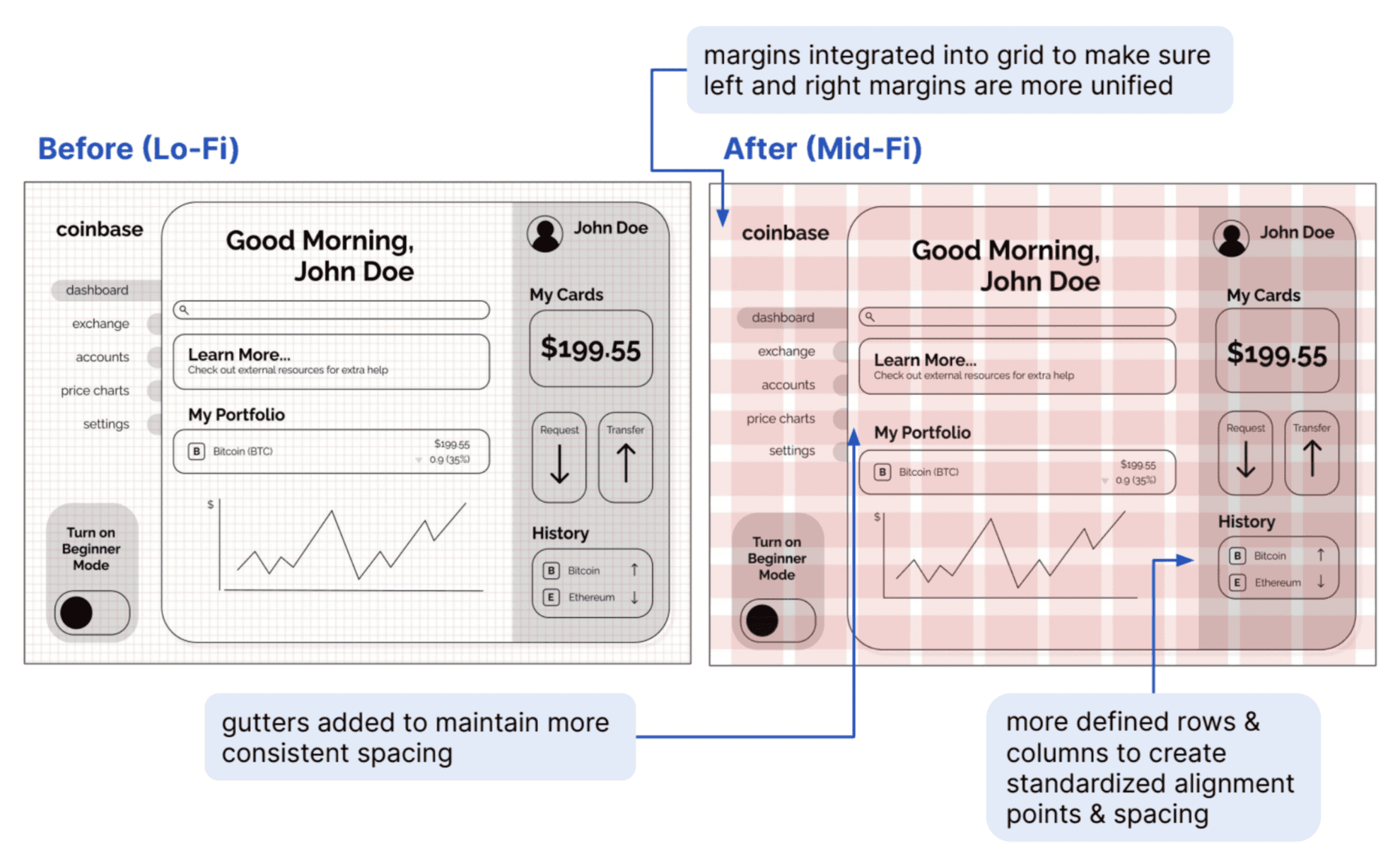
Grid:
Updated grid to account for margins and gutters
Created more unified grid units → stronger alignment
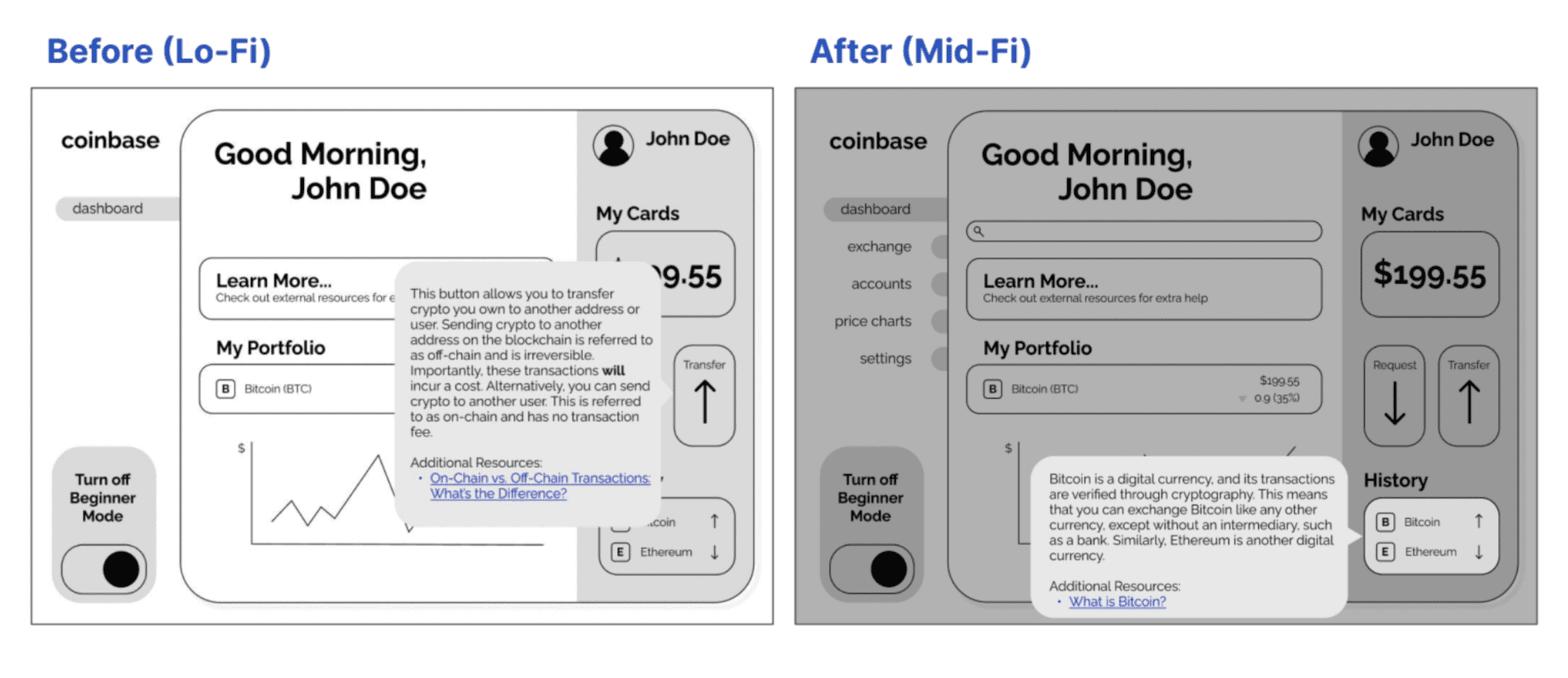
Feedforward/feedback:
Hover effects now functional, gives user feedback
Speech bubbles fade in rather than appearing instantly on hover → gives user time to process the feedback
Rest of screen dims on hover to give further indication that user is in a different "mode" on hover
Updated Grid System
Interactivity
Validation + Revisions
User Testing
We each split up and conducted interviews on people who had little to no crypto knowledge. In these interviews, I asked the user to complete a task, watched, and measured their success, as opposed to showing users how to do it if they got stuck.
Scenario + task: participant has downloaded Coinbase for the first time; using the prototype, navigate
around the dashboard to understand the meaning of all the information that is being displayed.
Hi-Fi Prototype
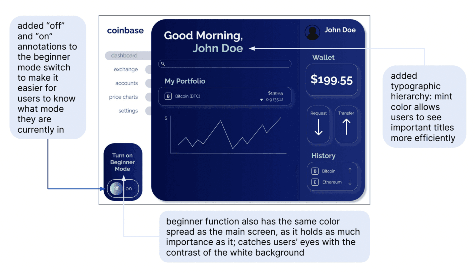
As we had a solid design for our prototype based on feedback from earlier stages, we decided to focus mainly on incorporating color to make our design more effective and have a more ‘cryptocurrency site’ feel
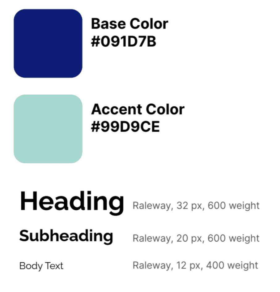
Colors: high tech / futuristic
Blues, mint, gradients, glowing white drop
shadow
Used primary and secondary colors
to add typographic hierarchy
Made the beginner function stand out
Used a contrast checker to ensure
accessibility
Typography:
Raleway: modern, sans-serif look and
common usage in tech websites
Created hierarchy by using varying font
weights and sizes for headings,
subheadings, and body text
Hierarchy
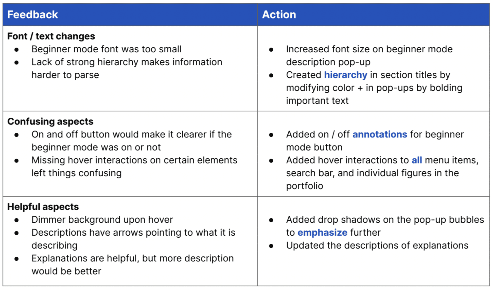
Response to User Feedback