responsive DESIGN | Course Project
Filipino-American Association of Pittsburgh
Role
Design Lead
Timeline
4 weeks
Skills
Interaction Design
Visual Design
Competitive Analysis
Tools
Figma
VSCode
Github
What I Worked On
The FAAP is a non-profit organization based in Pittsburgh whose purpose is to bring together members of the Filipino community in the area. As a student in Mobile Web Design and Development at Carnegie Mellon University, I was put into a group of 3 students and given the FAAP as our client to work with for the duration of this project. We each had a specific aspect that we were in charge of, mine being design, although we collaborated across all aspects throughout the entire project.
Problem
The FAAP website hadn’t been updated in over ten years, so the information was very out of date. The pages were all very text heavy, and there were many broken links and dead ends which inhibited access to information. There was also no established brand identity.
Solution
Create and implement new designs that reflect a sense of community and are less cluttered, with a layout that can easily be updated and maintained.
Design Process
Research
Initial client meeting
Competitive analysis
User personas
Initial Design
Site map
Lo-fi wirefames
Validation
Project proposal
User Testing
Revisions
Hi-fi wireframes
Development
Implemented via HTML/CSS/JS
Research
Initial Client Meeting
We began by setting up an initial meeting with our client in order to understand their scope and vision for the project. Prior to the meeting, we navigated to their site ourselves to understand their mission, and also to look for existing usability issues. When doing this, we found readability issues in terms of font-size, multiple broken links, empty pages, and outdated information. In order to get the most out of the meeting, we created an agenda and a set of questions related to information we wanted to have before getting started with the design process. Specifically we wanted to understand their goals for the website, their target audience, their current issues, what messaging they wanted to convey, and any requests they had for the redesign. At the meeting, it was quickly obvious that the client did not have a strong idea for what they wanted or didn’t want, and preferred that we took the lead in the beginning. They weren’t able to answer a lot of our questions, which made the initial design steps a little more challenging since we had to do a lot more background research in order to understand what they might want their website to look like.
Competitive Analysis
We began by analyzing the websites of other cultural organizations in Pittsburgh, as well as other Filipino-American Associations across the country to understand what works well and doesn’t work well. Specifically, we chose to look at the Bhutanese Community Association of Pittsburgh, the Filipino-American Association of Southern Ohio, and the Organization of Chinese Americans.
Some overall trends we identified across all the websites we looked at were:
The color schemes tend to be based on the culture/country the organization is representing
The most usable websites have a drop down in their navigation bar to break down the information into further categories and make it more digestible
There tends to be a lack of updated event information/calendars
Aside from informing our design decisions, this step allowed us to understand more about the goals of cultural organizations in general. Specifically, that they aim to foster a sense of unity within their community and boost membership by advertising their events and the benefits of joining their organization. We used this as a starting point for the design decisions in our lo-fi wireframes.
User Personas
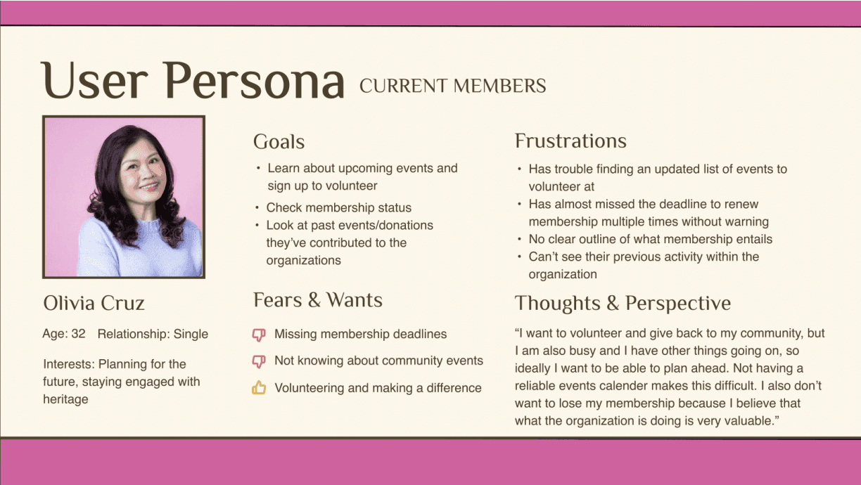
Current Members:
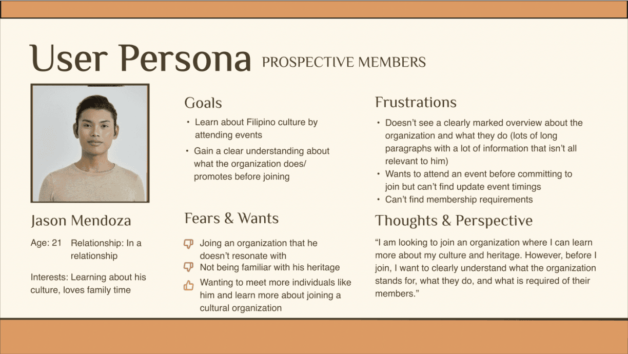
Prospective Members:
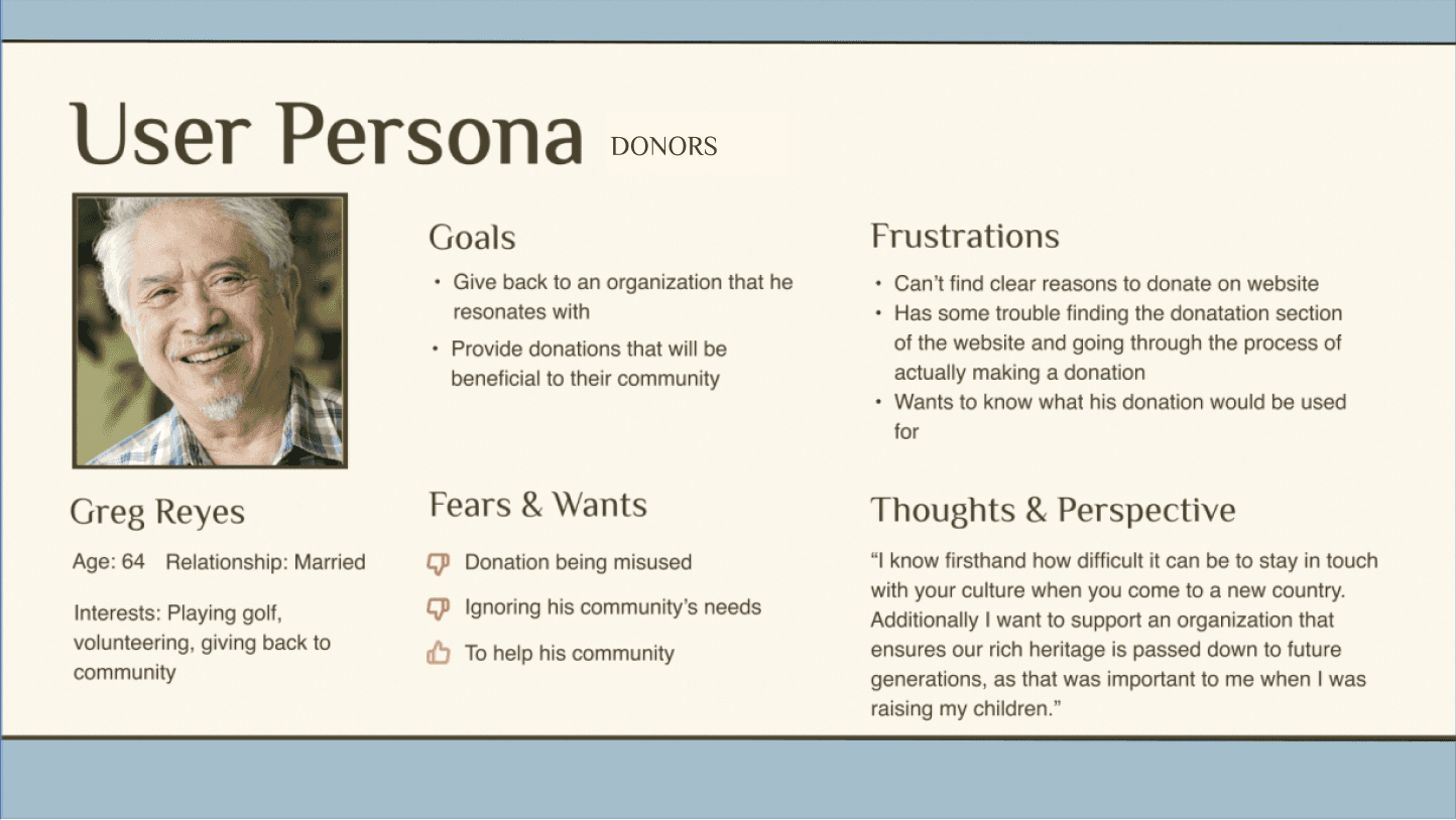
Donors:
Initial Design
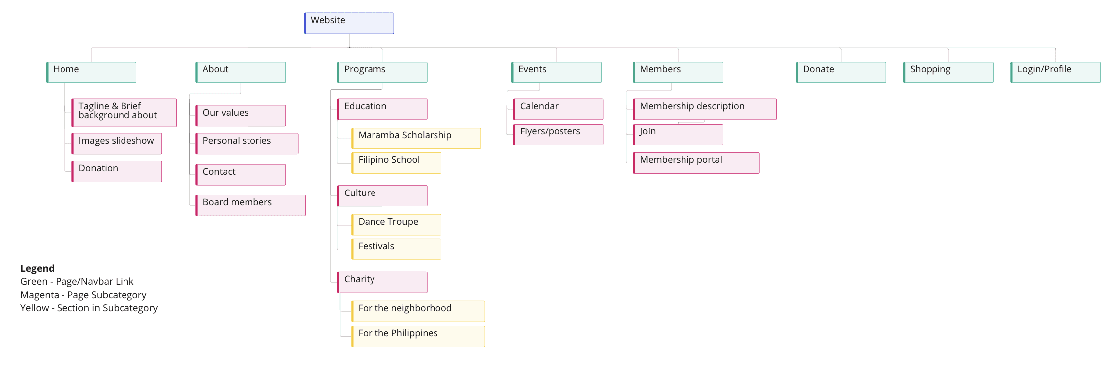
Site Map
Our team came up with the new site map for the website together. The current website had two sets of navigation bars, one at the top of the screen and one on the right hand sidebar. It was unclear which menu took precedence and which labels were the most important, so we decided to consolidate the labels into 5 categories at the top of the screen, and implement a drop-down menu so that the larger category could still be broken down into the most relevant subcategories.
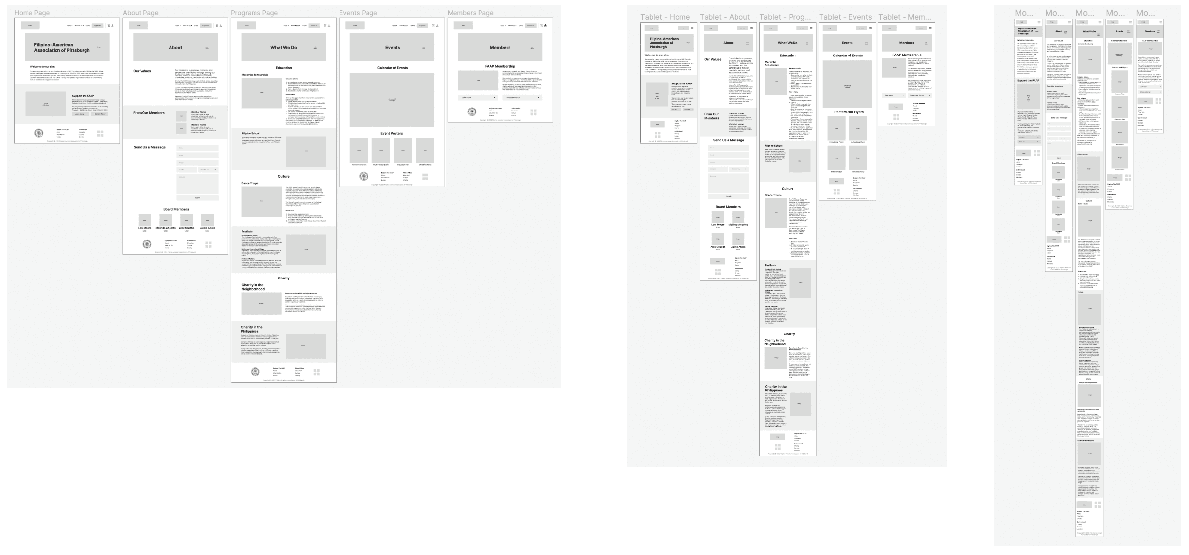
Lo-Fi Wireframes
Now that we had created the overall structure of the website, I took charge of creating the lo-fi wireframes for each of the pages. I created desktop, tablet, and mobile wireframes and implemented the column drop transition pattern between the three device sizes to maintain consistency in design. The main difference in the mobile wireframes were the hamburger menu. Some of the main highlights of the design were that I consolidated information into fewer pages, had just one navigation bar at the top, and put more emphasis on visual elements of the page rather than blocks of text in order to create a more pleasant browsing experience for the user. On the homepage, I prioritized the needs of prospective members and donors, since current members are likely already familiar with the organization and the website in general.
Validation
Project Proposal
As a team, we could now move forward in creating a cohesive proposal to present to our client at the next meeting we scheduled with them. At this meeting, we ensured that the site map and our condensed version of their previous content aligned with what they wanted to showcase on their website. After a few discussions with the FAAP team, we made a few revisions and sent them the finalized project proposal.
User Testing
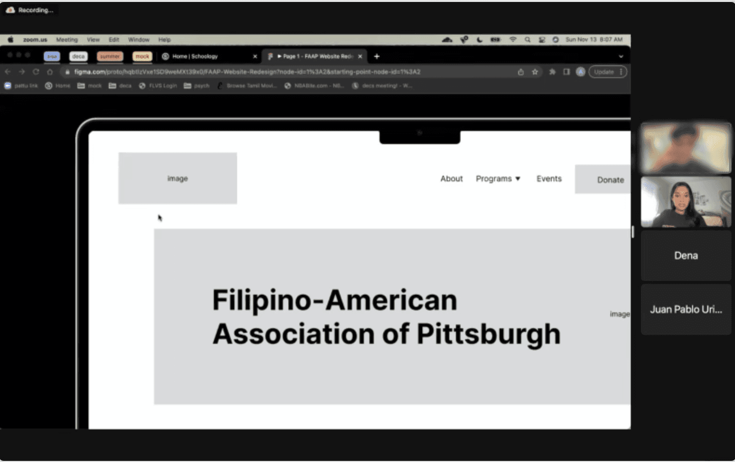
Since we had a condensed timeline to accomplish everything, we decided to conduct user testing by creating a low fidelity prototype using our lo-fi wireframes in order to catch the largest usability issues as early as possible.
We developed a script with a consistent set of tasks for each user to complete. One team member led the session, the other kept track of the time it took each user to complete each task, and the other team member was taking notes during the session. We rotated roles for each user testing session. We also developed a post-test survey for our participants to fill out in order gain some additional insights regarding how they felt about the tasks and the ease of use of the prototype.
Our main findings from conducting these sessions were as follows:
Higher footer usage than expected
The labels “events” and “programs” in the navigation bar were confusing (users could not immediately identify what the content in each of them would be before they clicked into the tab)
People seemed to be looking for hyperlinks in the content for ease of access (wanted more convenience)
Revisions
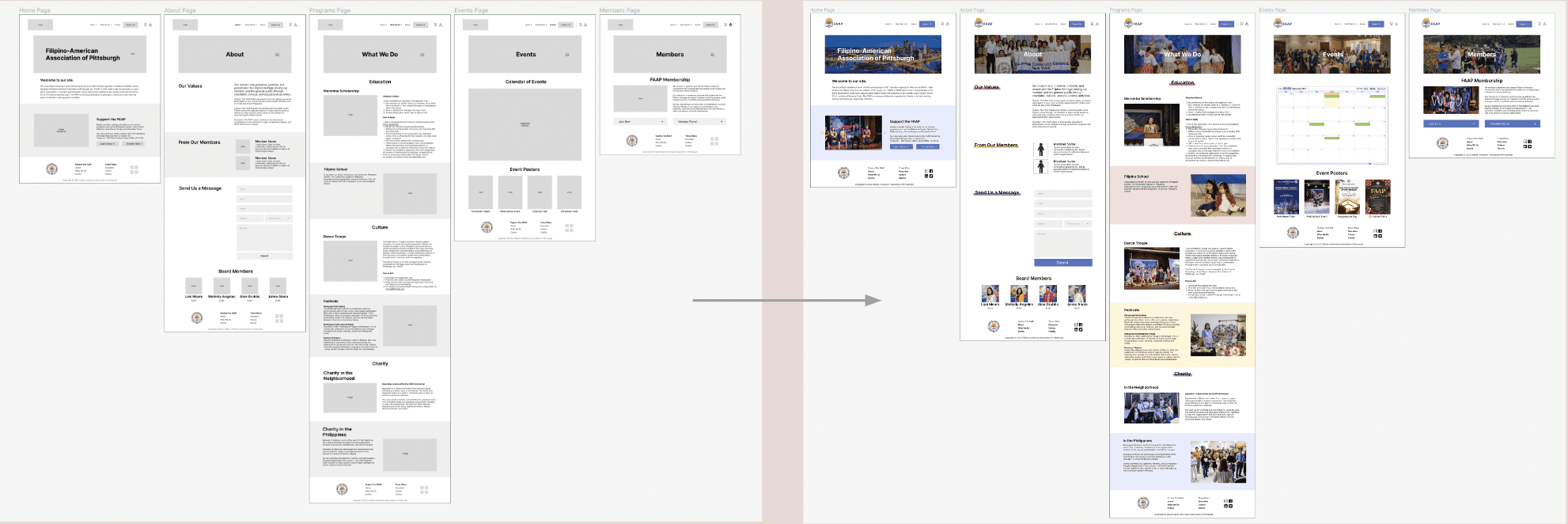
Hi-Fi Wireframes
In creating the final designs, I focused on implemented our user testing findings, as well as maintaining a clean visual experience when I integrated color. Our client mentioned that they wanted the colors of the Filipino flag integrated throughout the website, which are the primary colors: red, blue, and yellow. While these colors do complement each other, I was worried that combining all of them with their natural hue and saturations might be an overwhelming amount of visual stimulus for users. As a result, I went for a more muted version of the colors in my implementation, and ensured that there was sufficient whitespace in order to avoid this issue. Due to time constraints, I prioritized creating the hi-fi versions of the desktop and mobile wireframes, since they were the two extremes in terms of our responsive layout and I wanted to assess how the design choices would look on both. The mobile implementation looked fairly similar to the desktop in terms of coloration, but I realized that some pages had a lot of images to scroll through so I replaced them with an image carousel instead.
Development
Implementation
Now that we had finalized our designs, we moved on to implementing them using HTML, CSS, and Javascript. At this point, we had just under a week before we needed to present our final solution, so we split up the work between ourselves so that we could finish by the deadline. We used a shared GitHub repository to collaborate across our files. The biggest challenge was ensuring our responsive layout worked as we expected and was consistent across all of the pages. The code can be found on the following GitHub Repository.