WEB design | internship
Design@IBM
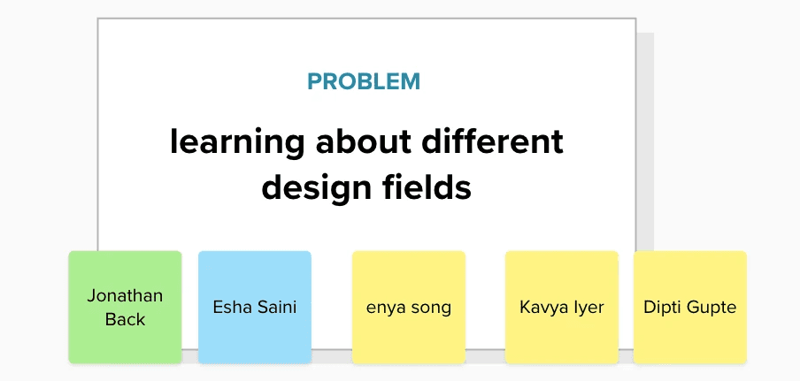
Collaborators
Kavya Iyer
Jonathan Back
Dipti Gupte
Esha Saini
Enya Song
Timeline
2 weeks
Skills
User Research
Interaction Design
Web Design
Tools
Figma
Mural
What I Worked On
Throughout the internship, the Design Interns within Client Engineering had a weekly sync to discuss what we were working on since we were spread throughout various teams and different markets, so that result in working with different industry clients. From these discussion, we realized that regardless of the difference, there were multiple reoccurring pain points that seemed to be brought up, so we decided to get together and attempt to devise a solution for some of them as a side project in addition to our main intern projects. Our goal was to be able to pitch our idea to current full-time designers before our internship ended.
Problem
Designers across different teams at IBM were curious about what designers in other areas were working on but had no straightforward way of sharing their work or contacting designers outside of their own teams.
Solution
Create a Behance/Dribble inspired internal platform for IBM designers to share their work and to collaborate across the design community.
Design Process
Research/
Discovery
Understanding problems
Prioritizing issues
Design
Problem selection
Specify solution
Wireframes
Multiple Iterations
Validation
Present to relevant stakeholders
Research/Discovery
Understanding Problems
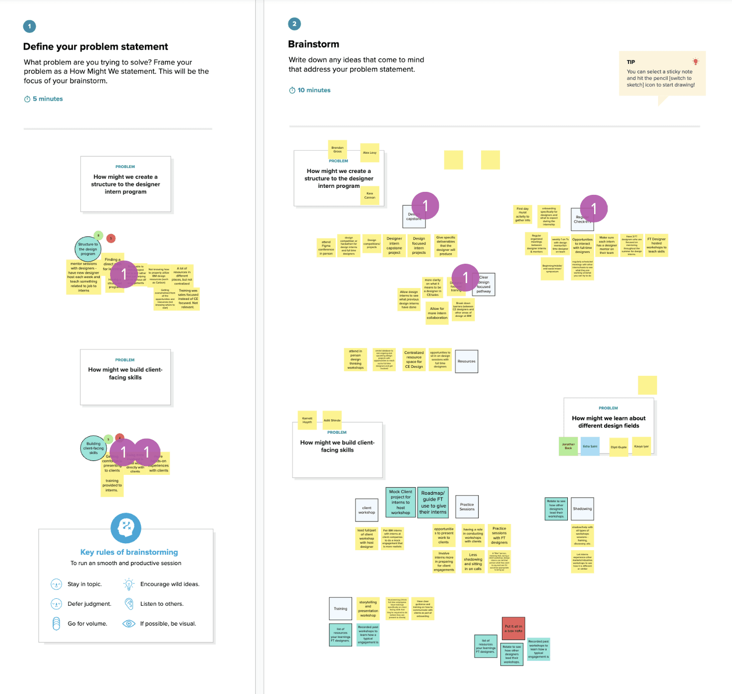
I suggested that as a team we begin our brainstorming process by having each member jot down various issues/pain points that we had heard from the full-time designers on our teams, or simply noticed during our time at IBM. As a team, we then grouped those stickies together to generate larger problem statements. Once we had some problem statements, we then delved into each of those areas and rapidly generated ideas to address them. The goal here was quantity, so that we would have a larger set of ideas to choose from as a starting point.
Prioritizing Issues
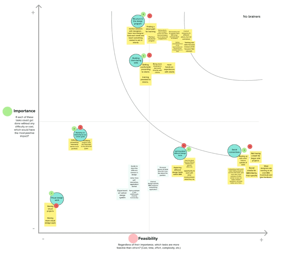
Given that we were working within a limited time frame, and that this was going to be an extra side project for all of us, I led an activity for us to prioritize each of the problem statements based on both importance and feasibility. This would allow us to gauge how much effort each of our generated ideas might take and whether they would really make an impact on our target users (the full time designers). To decide on these placements, I had everyone vote on a scale of 1 (least important/most feasible) - 5 (most important/least feasible) for each of the two metrics.
Design
Idea Selection
After going through the prioritization exercise, I realized that we had individuals interested in ideas across the board, and there were also some differences in the time commitment people were willing to devote to this project. Between that and the fact that we had multiple ideas, I decided to offer members the opportunity to split into multiple teams of 3-5 interns. Some of the projects were more research based, but I wanted to be on a project that involved more web design aspects as well. Based on that, I joined the team that was tasked with creating a solution that allows designers to learn about the different design fields available within IBM.
Specify Solution
In our small group, I led multiple brainstorming sessions to figure out how we wanted to tackle our problem. We tried to generate a range of ideas, from the simplest we could think of (simply creating an infographic detailing the different design fields/work individuals do at IBM), to the most complex idea we could think of (an internal Tinder-style app where designers could "match" with other designers to start conversations and make connections. Because there were a wide variety of ideas, we voted on one that fell somewhere in the middle of the spectrum — emulating a Dribble/Behance style platform for internal IBM use so anyone can view the work of other IBM designers and share resources.
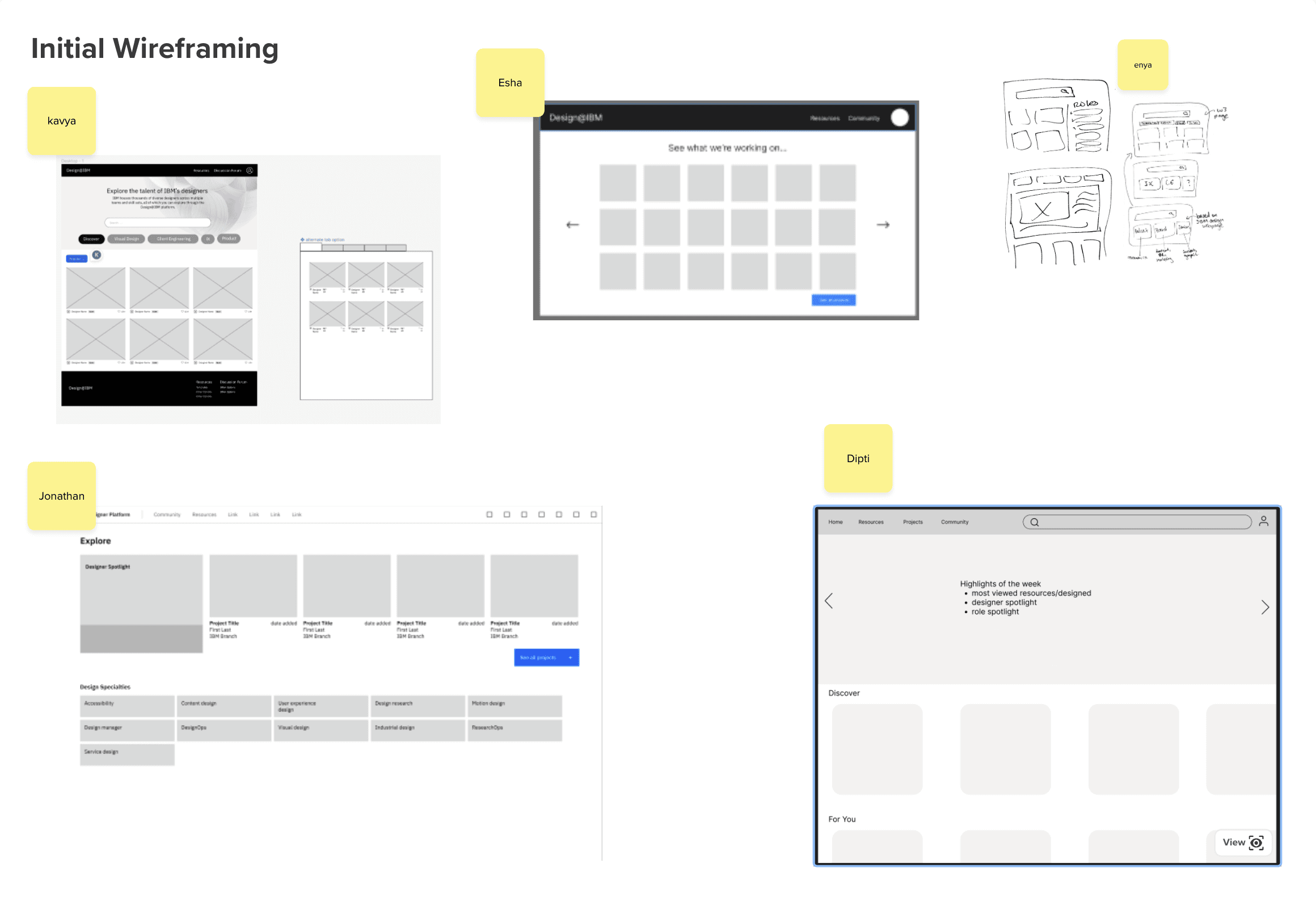
While we all had similar card style gallery view pages as the home screen, the main differences had to do with the information that was displayed on each card (i.e. if we wanted to just have project information or also include some social aspects like likes and saves), and the level of filtering available to sort the gallery view. My proposed design had the most customizability (search bar, the ability to filter by design category, and then the ability to sort the projects within that category), which my team decided was the best way to go in terms of giving the user the most control. I also had created an alternate tabbed page structure that my team-members wanted to find a way to incorporate. With my homepage wireframes as a guide, we decided to divide and conquer the rest of the pages, with Esha and I tag-teaming the homepage design.
Multiple Iterations
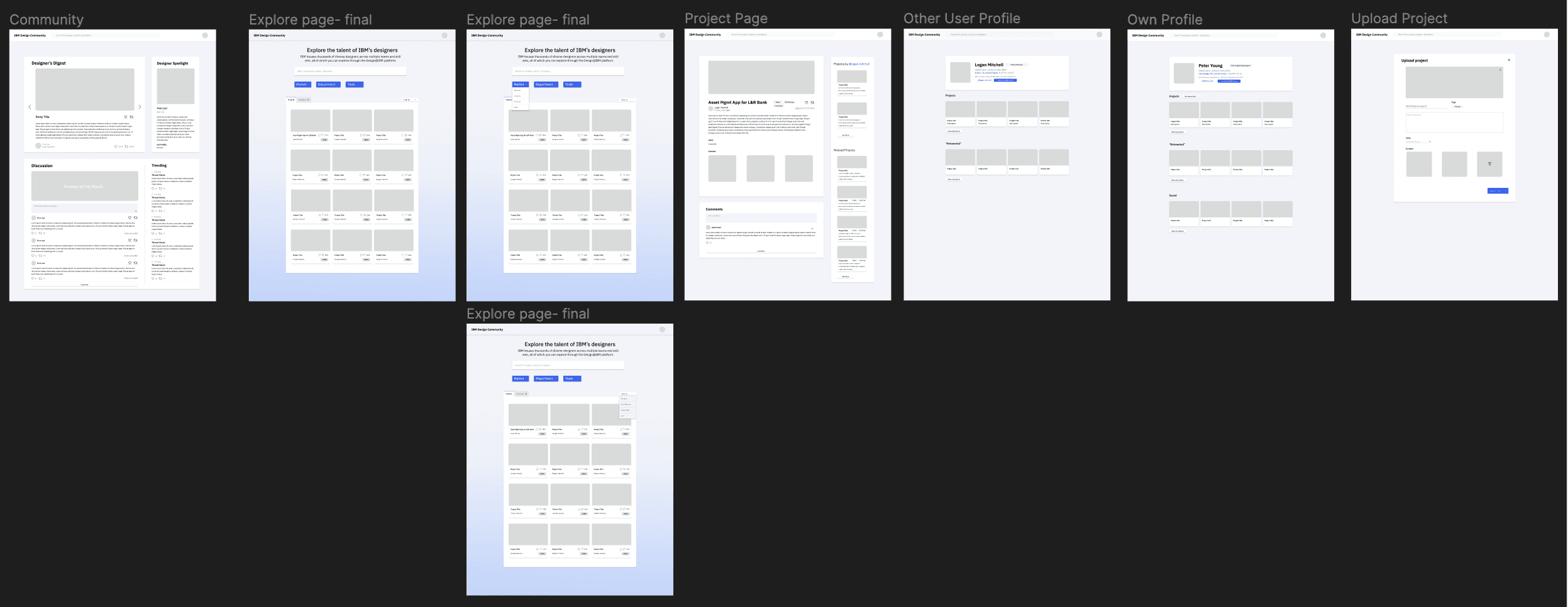
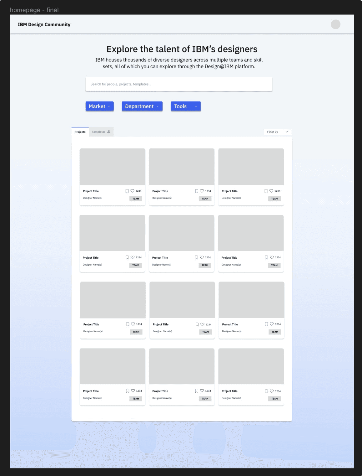
At the next meetings, each of us shared the progress we had made on our respective sections. One of the main points of contention regarding the homepage had to do with the hierarchy of the filters (which ones should be the top level and which one should be the secondary level, as well as how they should be displayed (multiple button vs. dropdowns). The below image was what Esha and I finally decided on based on the feedback. We included a search bar so users could look for specific projects, dropdowns to represent the different markets (national, pub-fed etc.) that projects fall into, and the tools that were used for the project. We also implemented a tab structure to separate projects vs. templates/resources that could be duplicated and used by a wider audience. The sub-filters are grouped with the tabs to allow users to sort by metrics such as recency, number of likes, alphabetical etc. The filters used in this design were placeholders based on what we thought would be useful based on our time at IBM, but this structure would allow for the full time designers that adopted the project to adjust them as they saw fit.
Validation
Project Presentation
Our team, along with the other teams that had split off to tackle some of the other problem statements, set up time to present our projects to multiple full-time designers across a variety of teams. At this presentation, my team presented our full set of wireframes, as well as a click-through demo that we talked through live. We received lots of positive feedback that validated the idea that designers wanted to be able to connect with other designers, and they appreciated this visual approach to forming those connections. One thing we acknowledged that they echoed was the fact that the filter options would likely need some more refinement based on conversations with the full-timers and what exactly they wanted.
For this presentation, Esha and I also created Community page before the presentation to increase the connectedness across the platform. The community page features a blog, designer spotlight, a discussion prompt that anyone can contribute to, and features "trending" projects.
Full Set of Wireframes