
course project
Responsive Web Design and Implementation
Timeline
4 weeks
Skills
Visual Design
Responsive Design
HTML/CSS
Tools
Figma
VSCode
What I Worked On
In this project, we were asked to pick a topic of personal interest to us and create a website using HTML/CSS that has a responsive design for different device sizes. We also had to justify all of our design choices for the fonts and colors we used in the project.
Project Vision
The website I chose to create is about different types of seashells. It will feature a variety of seashells, from some of the most commonly found to the most rare ones. I grew up in San Diego by the beach, so I’ve collected seashells ever since I can remember. The collection currently resides in multiple boxes stored in one of the cabinets in my bathroom at home, organized by the date and location that I found them. I haven’t added to the collection in a few years since I moved farther away from the water, but the beach has always been my safe place, so I’ll take out the collection once in a while when I need a serotonin refresher. Since seashells are an object of interest to me, I wanted to use it as the focus for this project.
Research
Inspiration
Before I created my wireframes, I wanted to do some research regarding the way other sites have implemented a responsive layout. The sites I chose to look at and my observations are found below.
I like the use of color behind the text on this site and also liked how the navigation bar looked on my tablet. I thought the color helped add to the visual appeal on the website, and also played into key themes. They had the background color be pink, and the philanthropy they support is women’s heart health, so it made sense. I also thought the placement of the logo/menu options made it easy to navigate across pages without having to click too many different things, and I liked the three images at the top. For these reasons, I decided to incorporate both those elements into my design.
I used this website to analyze when/how to stack content that was previously side by side. In my website, I only have two columns while this one has three, but they also switched some things from a vertical to a more horizontal layout within each element when they were stacked on top of each other, which I used for inspiration in terms of changing the direction of my timeline when stacking.
I used this website when trying to decide whether I wanted to use any off canvas elements. I took inspiration from the way they had their hamburger menu, but other than that, I decided that I didn’t want to do any other “off canvas” elements.
Design
Wireframes
After observing other websites, I chose to implement a combination of the column-drop and mostly fluid layouts on my own site because it felt the most intuitive for the content I had planned. I created a lo-fi wireframe for mobile, tablet, and desktop so that I had a vision of what it would look like before I began my implementation.
design choices
As part of the project, we were also asked to provide an explanation for all of our font and color choices.
Font choice rationale:
Headings/Navigation: Kalam
Body text: Open Sans
I decided to use these two fonts because I wanted all my fonts to be fairly simple. To me, the beach is a place to relax and be calm, and I wanted to use fonts to echo that sentiment. Because of this, I stayed away from overly decorative fonts. I chose to use Kalam for the headings because it has a bolder weight than Open Sans, and I wanted there to be a clear distinction between the headings and the body text. Additionally, it had a hand-written look that I feel made the website more personal and welcoming. I also used it in the navigation because I wanted to draw attention to the different options in the menu. I used Open Sans for the body text to continue with the simple font theme, as well as because it had a lighter weight which makes it easier to read longer sections of text.
Color choice rationale:
I chose a color palette of blue, tan/brown, and some peachy nude shades (peachy colors are coming primarily from the images). Since the website is about seashells, I wanted the colors to also represent the beach. Additionally, this was a triadic color scheme based on blue, beige, and pink, so the colors also balance each other out. Overall, the shades I chose are more cool toned because I didn’t want the color to be too aggressive and take away from the text and the images I have displayed. The browns/nude colors that I chose were based off the pictures that I displayed at the top, since the three pictures all had a fairly similar color scheme, and I wanted to maintain that for consistency.
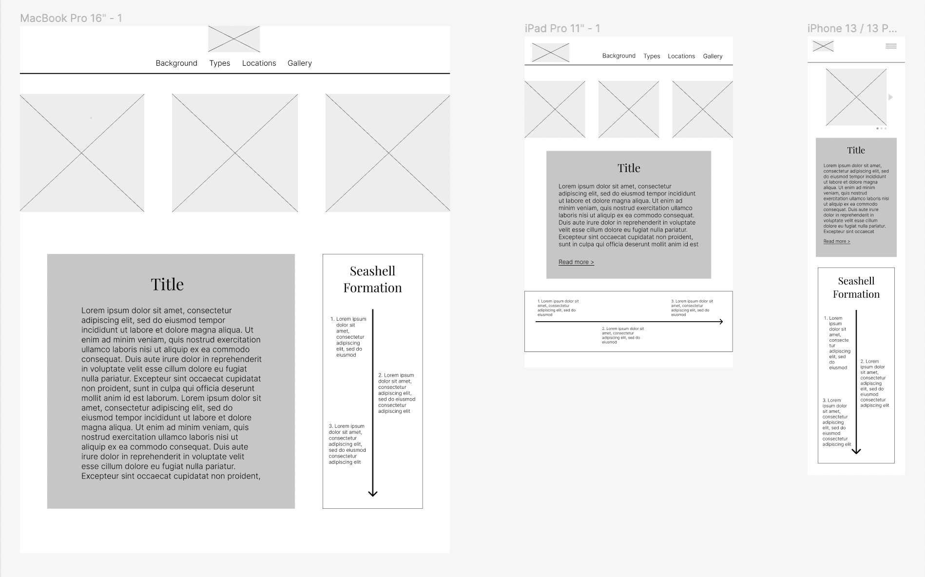
Design transition pattern: Column Drop/Mostly Fluid
Desktop version:
There are three images in a row at the top, and underneath, there is a two column layout with some text and an image.
Tablet version:
The transition from desktop to tablet is a column drop. The rightmost column drops under the body text, so there are still three images at the top (although resized to be smaller), and then below that, there is one column consisting of text and then the timeline image displayed horizontally.
Mobile version:
The transition from tablet to mobile is mostly fluid. All the content is stacked vertically on top of each other. There is only one image displayed at the top. In the wireframe, it is shown as an image slideshow as that is ideally what I would like to do. However, since that requires interaction, and likely javascript that we are yet to learn, I was unable to execute that. I also condensed the navigation bar into a hamburger menu (might be considered off-canvas, but not the main transition design used).
Implementation
Code
Now that I had planned the whole project, I moved on to creating it using HTML and CSS. I used different classes and ID’s for each of the elements on the page and media queries in my CSS files to reorganize the placement of each element depending on the browser size. The final implementation is currently hosted here. The responsive design can be seen when resizing the viewing window.