
Internship
Simplify.hr
Role
UI/UX Designer
Timeline
1.5 weeks
Skills
Visual Design
Interaction Design
Competitive Analysis
Tools
Figma
What I Worked On
Simplify.hr is an HR company based out of South Africa. As an intern with MakeReign, a South African based digital interface company, I worked on a project that involved creating a proposal to submit to Simplify.hr in order to secure them as a client.
Challenge
Create a proposal that includes a redesigned home page as well as a wireframe for a dynamic image gallery. The biggest challenge was incorporating all the different colors into the website without being visually distracting.
Goal
The new designs should reflect their new brand identity, as well as feature all the different aspects of their company.
Design Process
Research +
Discovery
Competitive Analysis
User personas
Design
Site Map
Style Guide
Wireframes
Prototype
Create a clickable prototype to be submitted as part of the proposal
Research + Discovery
Competitive Analysis
Being from the United States, I wasn’t very familiar with HR companies in South Africa, so I began by doing competitive analysis on the websites of two South African based HR companies, EVA Solutions and LabourNet, using Nielsen’s usability heuristics as my critiquing guidelines. I also applied those same usability heuristics to critique the current version of Simplify.hr’s website. My main takeaway was that the principles violated most often across all the websites were #3: user control and freedom, and #8: aesthetic and minimalist design. A lot of the pages had many elements all competing for the users attention with no indication as to what was the most important. Additionally, when clicking to different pages of the website, many times, there was no way to get back to the previous page. As such, I wanted to put a lot of focus into making my design both intuitive as well as simple to navigate.
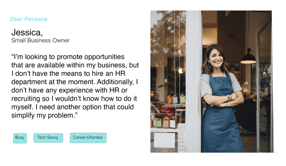
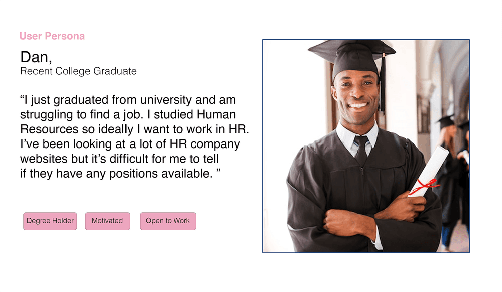
User Persona
In the brief I was given, they mentioned that their main target audiences were general users followed by prospective recruits. Based on this, I created two user personas to better understand the needs of each of these two groups.
Design
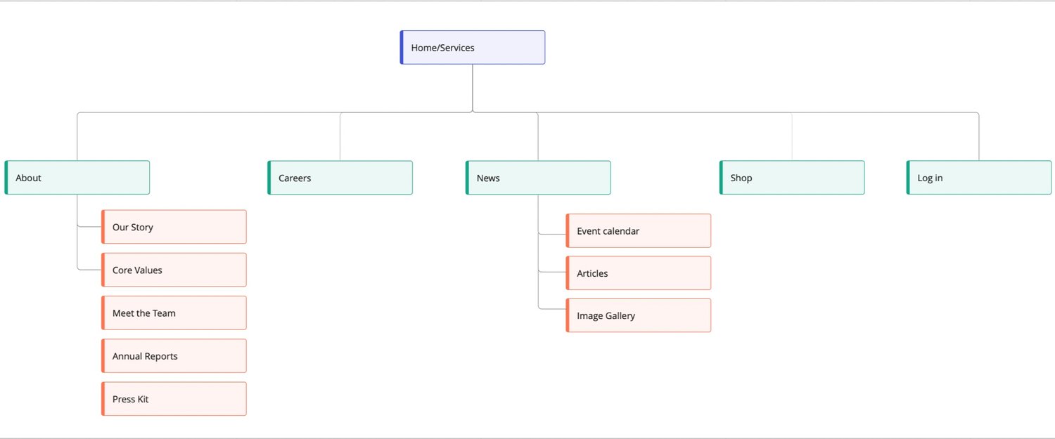
Site Map
Now that I had researched what some other companies were doing, as well as what could be improved in the user flow of Simplify.hr’s current site, I began by creating a rough site map based on what I had observed.
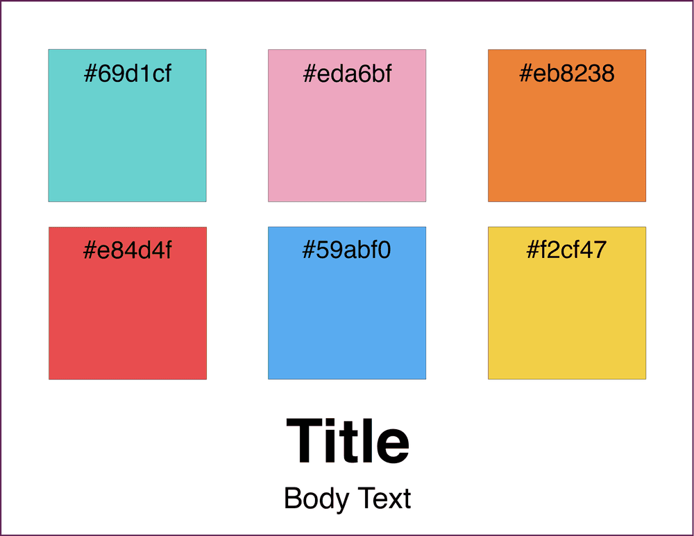
Style Guide
Additionally, as part of the brief, the client had included some brand guidelines, so I used those to create a style guide that I could easily refer to.
Lo-Fi Wireframes
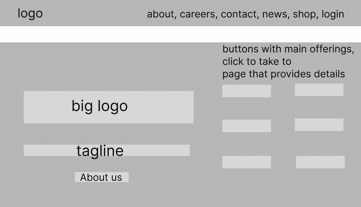
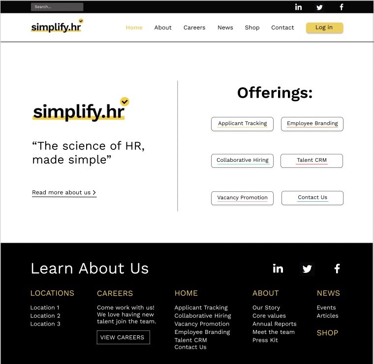
I designed the home page primarily based on a general user’s needs. However, I kept the prospective recruit audience in mind by ensuring that both the “About Us” and “Career” sections are easily accessible from the home page/header. This allows prospective recruits to learn about the company to see if it’s a good fit for them, and then easily apply for open jobs.
When you first visit the site, all the different services will be displayed, and depending on which one you click, you will be taken to a page with more details. Each of the service pages can also be accessed by scrolling down on the home page. There is also the option for users to go directly to the “About Us” page to learn more about the company.
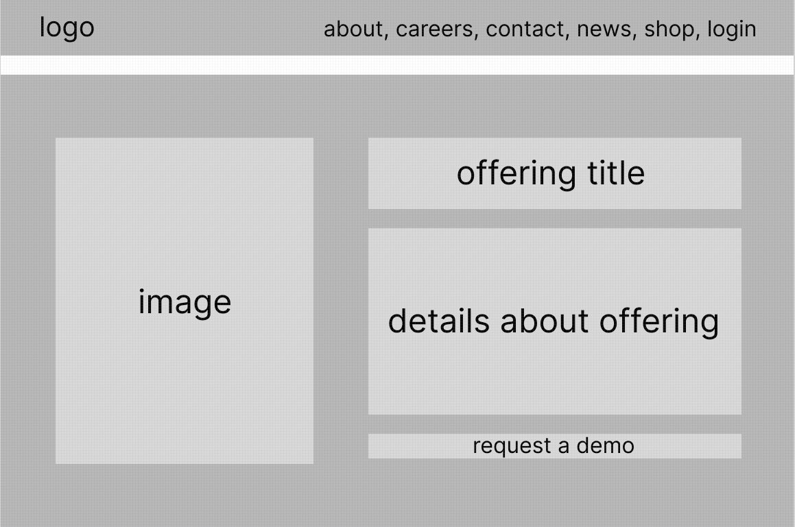
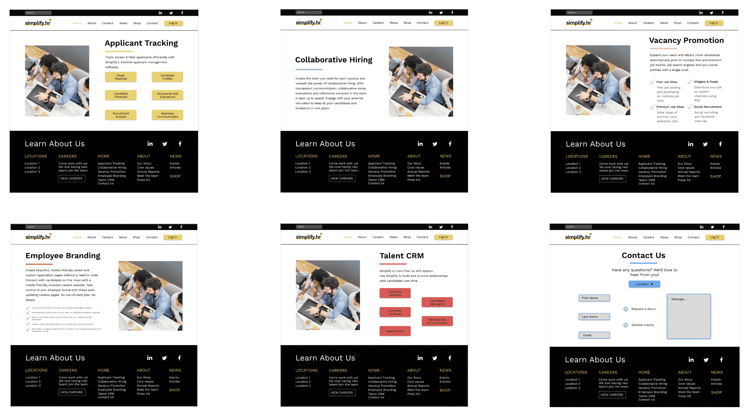
On each of the service pages, I decided to keep the same general structure in order to maintain clarity and consistency. The main purpose of these pages are to give details about the offering, as well as for users to request demos of the specific offering.
Mid-Fi Wireframes
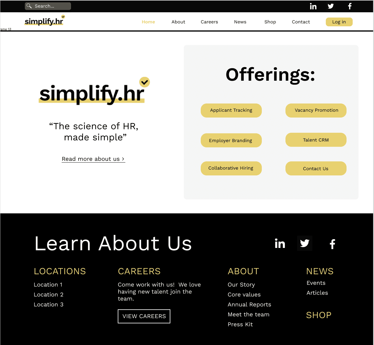
My only use of color on the home screen was yellow, since that was their main brand color, and is also present in their logo. Since they had a wide range of secondary colors, I was worried about them clashing.
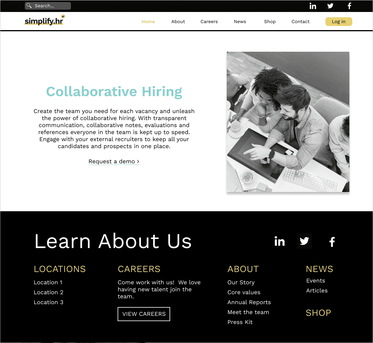
I decided to utilize the brand’s secondary colors on each of the offering pages, so that each offering was associated with a different color, thus providing some additional differentiation between them. To the left is an example of what one of the offering pages might look like.
Hi-Fi Wireframes
In creating the final designs, I continued to refine the simplicity of each of the elements on the screen, as well as the color usage. Additionally, I made some practical changes as well, primarily the alignment of the text and buttons. In the previous design iteration, many things were center aligned, but left aligning the text across all the pages made the most sense from a readability perspective.
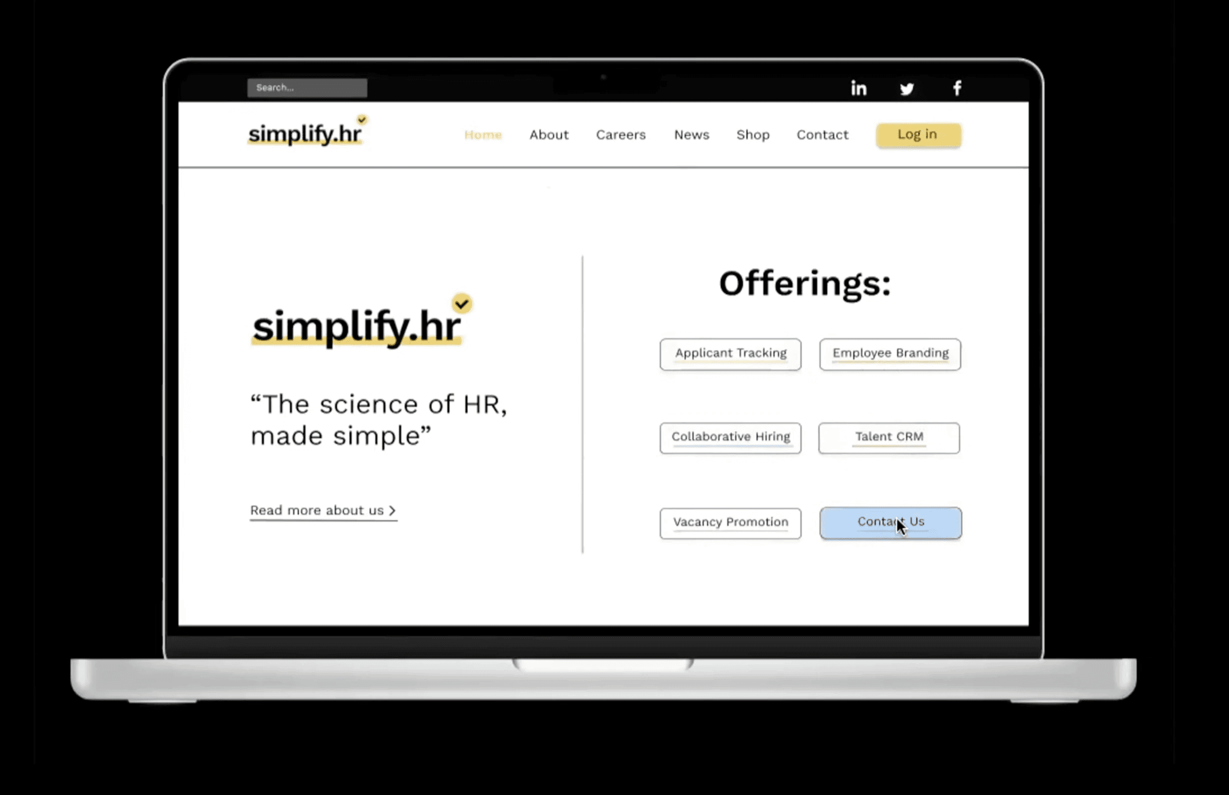
Since I had incorporated the secondary colors to be associated with a certain offering, I wanted to keep that consistent and include the respective colors in the offering buttons on the home page as well. The challenge here was figuring out how to use so many different colors at once without it being overwhelming for the user. Eventually, I decided to underline each of the offering names with the respective color so it was still included, but more minimal.
I wanted to make the color usage of these pages as minimal as possible as well. I decided to incorporate the color in a partial underline under the service title. I also took a look at the text that the brand had on each page and realized including it all on one screen would be too visually busy. Thus, on some of the pages, I incorporated a series of buttons that would open a pop-up window when clicked that provided more details. This way, the user would have control over which specific elements they wanted to learn more about. Additionally, I decided to move the demo requests to the “Contact Us” page, because after talking to my manager, he suggested that it may be too redundant to have it displayed for every single offering.
Prototype
main pages
On the home page, to further the association of the secondary colors with each offering, I added some additional interactivity to the offering buttons, When the user hovers their mouse over a certain button, the color of the button would change to that offering’s color but at a lower opacity. This ensured that only one button at a time could be completely filled in, thus eliminating the issue of visual clutter due to too many clashing colors.
dynamic image gallery
I then moved onto the second part of the proposal, which involved creating a wireframe and prototype for a dynamic image gallery. I wanted the movement of the images to be more than just a typical slideshow, but also not too distracting. Additionally, based on Nielsens first principle, the visibility of system status, I also wanted to include some sort of progress bar so the user knew how many images there were and where in the series they were currently at.
With this in mind, I designed the image gallery displayed below.