
UX DESIGN (MOBILE) | Personal Project
Synergy
Role
Designer
Timeline
2 weeks
Skills
Research
Visual Design
Competitive Analysis
User Interviews
Tools
Figma
Google Suite
What I Worked On
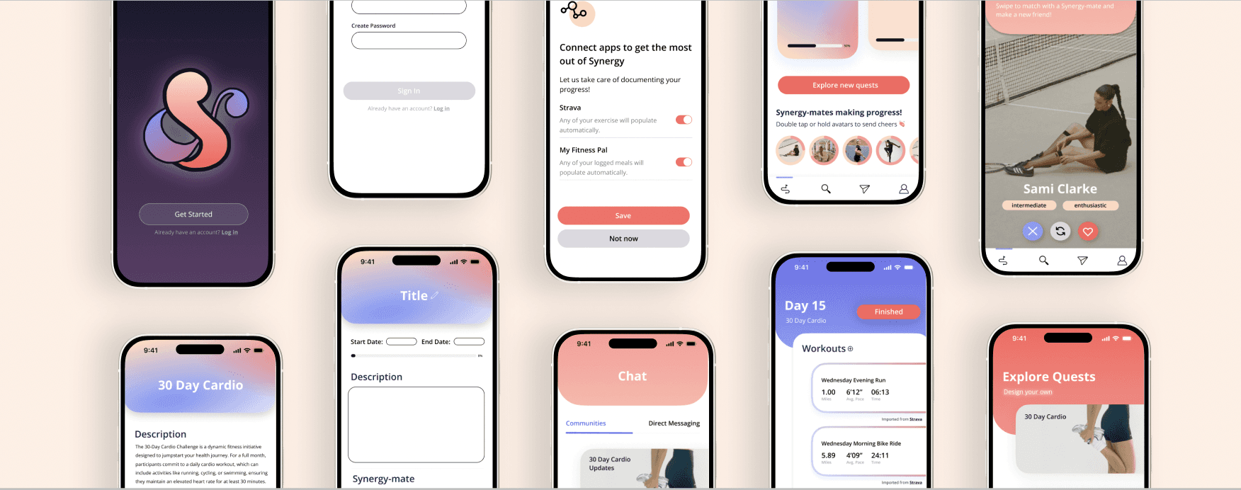
I created a social fitness platform designed to foster community & connection. I was inspired by conversations that I was having with my friends about the new year/new year's resolutions, and wanted to dig deeper to see if I could design a solution within this area. The end result was a fitness mobile app aimed at making pursuing fitness related challenges and goals a more community-based pursuit.
Problem
Fitness related goals are difficult to maintain. They can feel isolating, and with no real accountability they are often neglected.
Solution
Create an app that fosters a social community to encourage and motivate users that are pursuing fitness goals.
Design Process
Research
Survey
Online Research
Competitive Analysis
Validation
User Interviews
Affinity Mapping
User Journey
Storyoard
Concept
Logo & Branding
Design guide
Iterations
User Testing with lo-fi wireframes
Hi-fi wireframes
Final Designs
Research
Survey
Before getting into the actual design process, I wanted to do some initial research to assess if my proposed problem space was relevant. To do this, I created a survey asking some general questions about people’s new year’s resolutions, like what category they fell in, which one they found the most difficult, and why they found it difficult. I tried to keep it direct and to the point so the people I sent it to would be more inclined to complete it, especially since a lot of my circles were semi checked-out due to winter break.
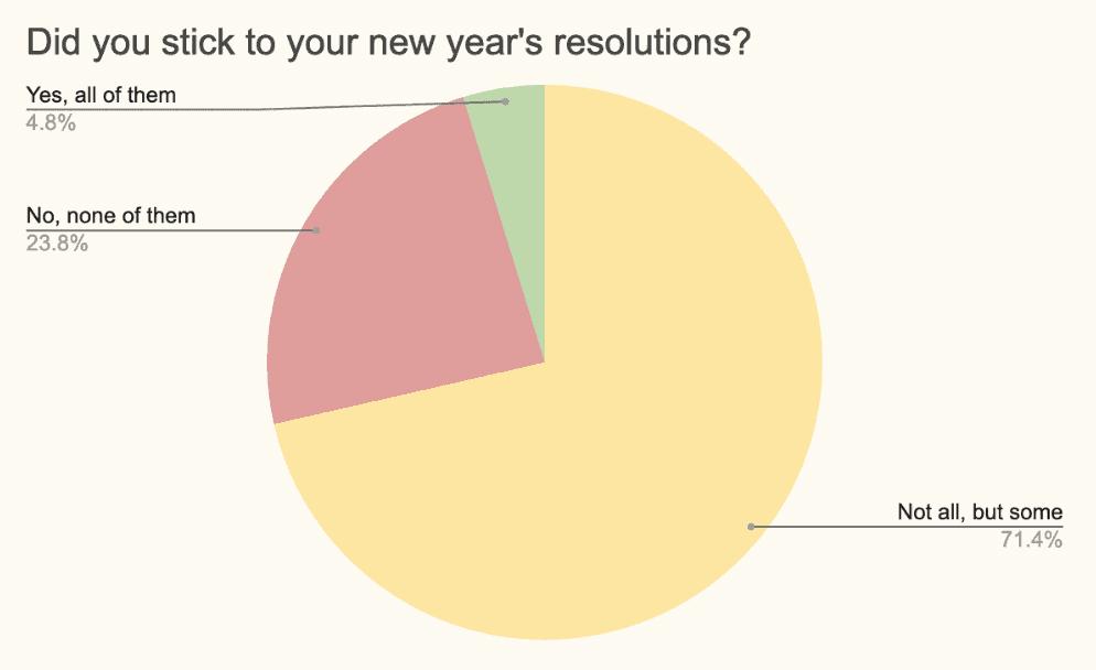
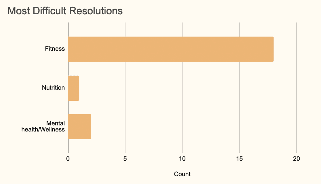
Based on this survey, I found that this is a valid problem space because 71% of my respondents didn’t complete all their resolutions, and 24% completed none of them, with only 5% having stuck to all of their resolutions. However, new year’s resolutions in general are still a very large problem space, so I turned to some of my other survey questions to figure out how to narrow it down. I had asked a question about which category my respondents’ most difficult resolution to stick to fell into, the options being mental health/wellness, nutrition, fitness, educational, and other. Based on the responses, a majority of people seemed to find fitness related resolutions the most difficult to stick to.
Online Research
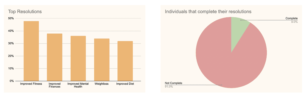
I supplemented these findings with research papers I found online. In an article by Forbes, they write that "More people cite improved fitness as a top resolution (48%) compared to improved finances (38%), improved mental health (36%), weight loss (34%) and improved diet (32%)". Another article from the Fisher College of Business stated that "researchers suggest that only 9% of Americans that make resolutions complete them. In fact, research goes on to show that 23% of people quit their resolution by the end of the first week, and 43% quit by the end of January."
This gave me enough cause to justify trying to design a solution within the fitness problem space.
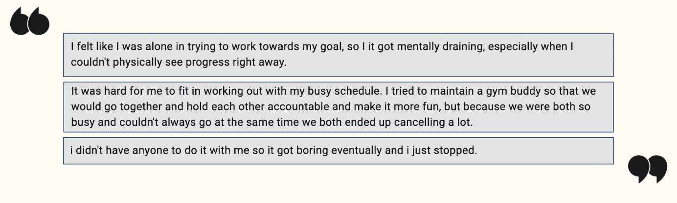
Digging Deeper
To dig deeper into this problem, I turned to one of the free response questions on the survey where I had asked why their most difficult resolution was the most difficult. The fitness related resolution responses were fairly consistent across the board, a few of the responses included:
Competitive Analysis
Since I knew the fitness space is a fairly saturated market, I wanted to do some competitive analysis first to understand what other apps are already providing before I jumped in.
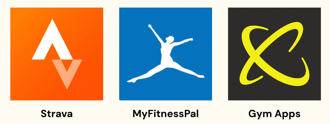
I chose apps that were ranked highly in the app store and evaluated each of them. Strava provided a more social aspect that other apps don't but it's catered mainly towards cardio related activities with GPS tracking. MyFitnessPal is a popular meal tracking app that is compatible with a lot of other fitness apps. Additionally, I found that the gym app that people use to track their workouts tends to vary depending on their local gym and their personal preferences, so there was a lot of variety.
Based on this, I decided that rather than looking to replace one of these apps, my solution should involve some sort of overall shell that provides compatibility within which all of these different apps could coexist depending on user preferences in terms of their platform choices.
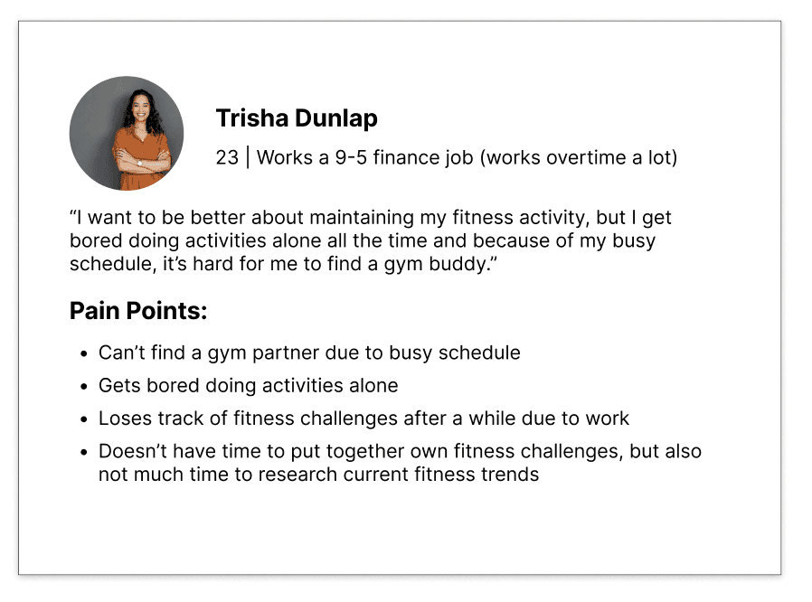
User Persona
Based on all the information I had gathered thus far, I created a user persona.
Validation
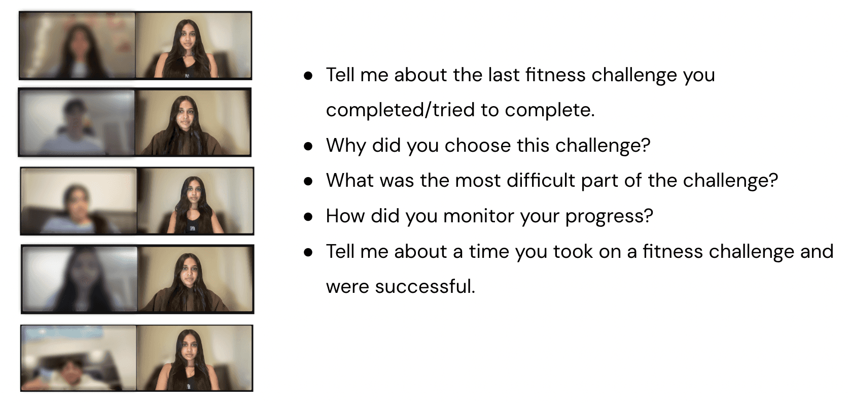
User Interviews
Now that I had a more refined problem space and a better understanding of the landscape, I decided to conduct user interviews with individuals that fit my target user to hear about their experiences and better empathize with them and their needs. I conducted 5 interviews with individuals that I knew had set fitness related challenges for themselves at various points of time so that I could listen to them talk about their experience.
Affinity Mapping
Based on my interviews, I used my notes to create an affinity map to identify the following three themes.
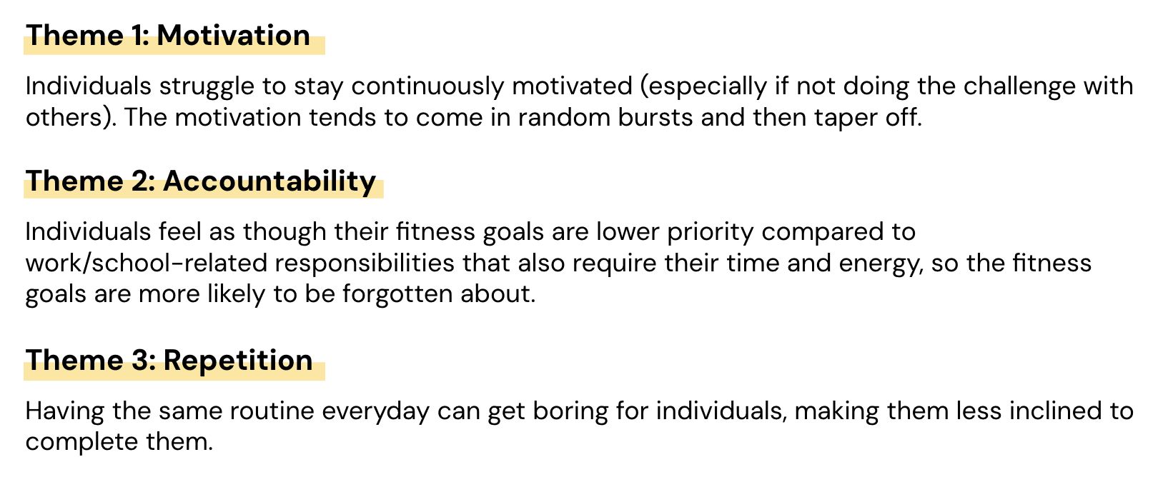
User Journey
I also used those themes to create a user journey based on the user persona I created earlier.
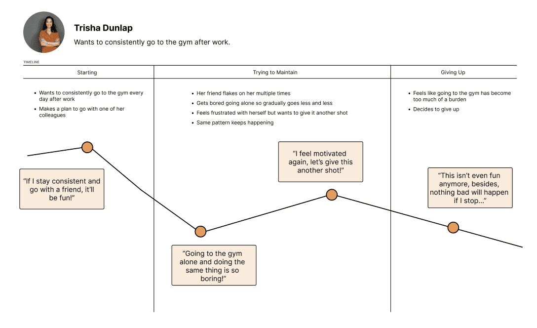
Based on this, I decided to focus on the following question:
How might we make pursuing fitness goals a more community based & socially rewarding experience?
Concept
Storyboarding
Now that I had an overarching question, I drew out storyboards to begin conceptualizing what an interaction to combat the feelings I outlined in the user journey might look like.
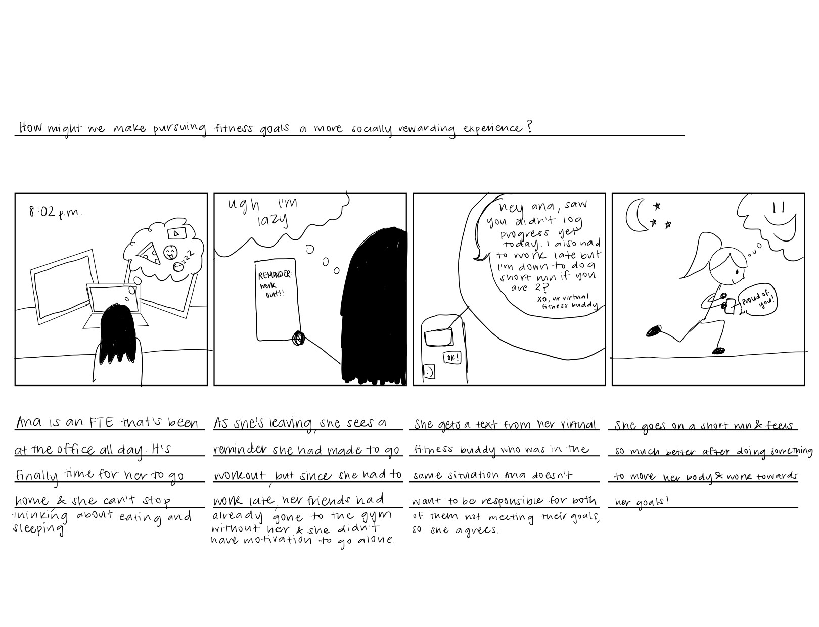
This helped me solidify that I wanted an app that placed an emphasis on communication between users more so than the actual challenges/workouts they might be doing. This storyboard was also when I first realized that I may be able to integrate some psychology concepts into the way the app was structured!
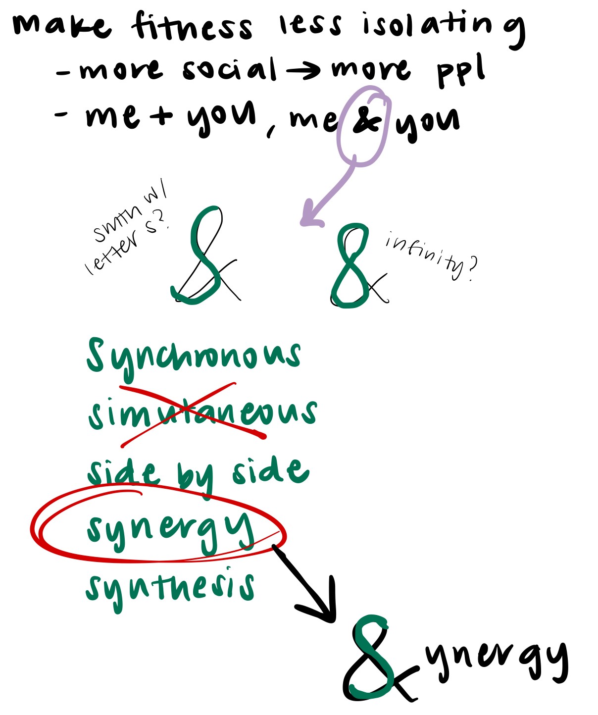
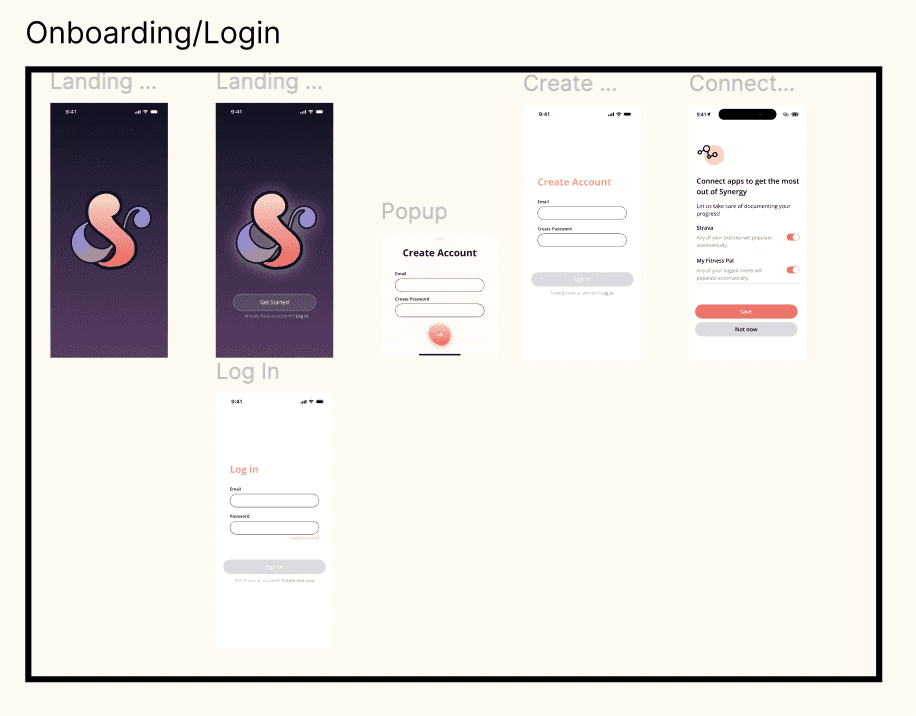
Logo and Branding
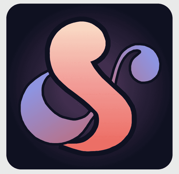
Before I jumped into designs, I took some time to think about what I wanted the branding of my app to be. I wrote out words I associated with the concept, and what stood out to me as a common pattern was the word "and". This word can also be represented as an ampersand. I then noticed that an ampersand resembles either an infinity sign or the letter "s". At first I was partial to the infinity sign because the app represented a constant back and forth between everyone in the community to empower and uplift one another. However, as I thought about words that started with the letter s, I was really drawn to the word "synergy". Synergy is two or more parties working together to create something greater than any of them could do independently — which is exactly what I was aiming to do with this platform. Each individual user is made greater through the support from their community.
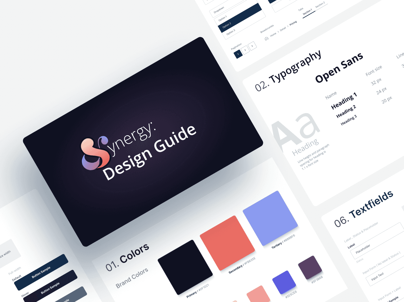
Design Guide
The concept of Synergy reminded me of new beginnings. This whole project was inspired by the new year, and this idea of turning what were once independent, isolated goals into larger team efforts was reminiscent of users coming together and getting a new chance to accomplish their goals — this time together as a community. Because of this, I wanted the color palette to be reminiscent of dawn, since that is what I think of when I think of new beginnings.
Iterations
Lo-fi Wireframes
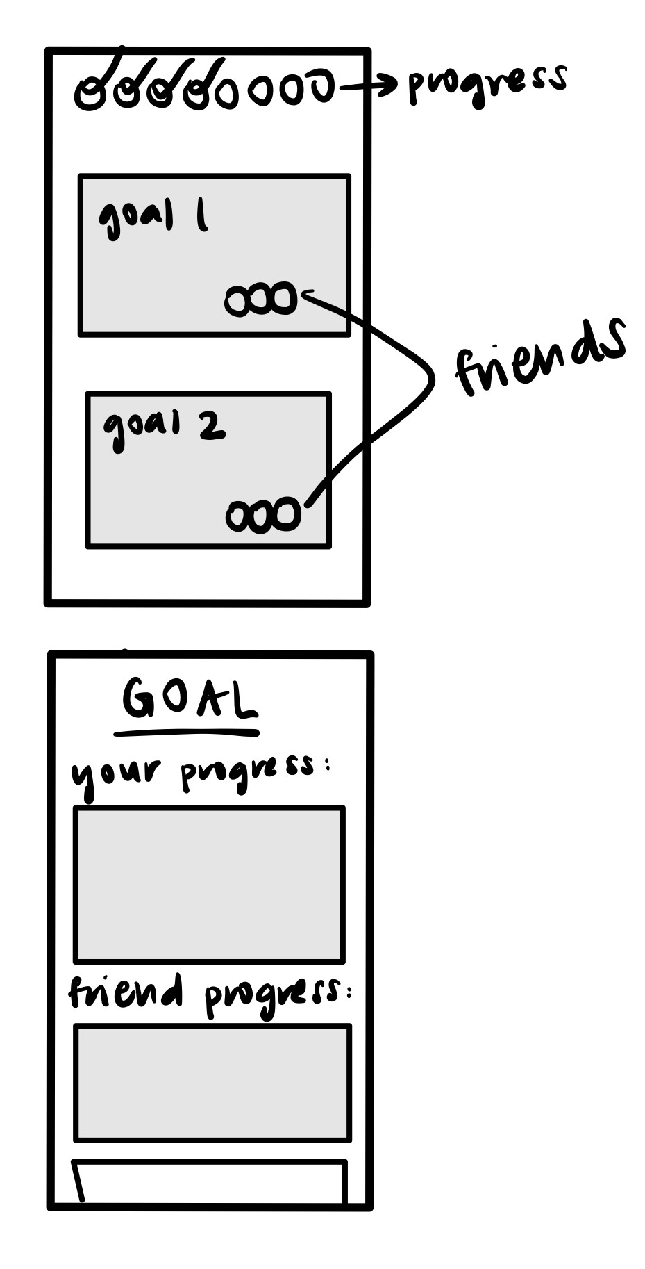
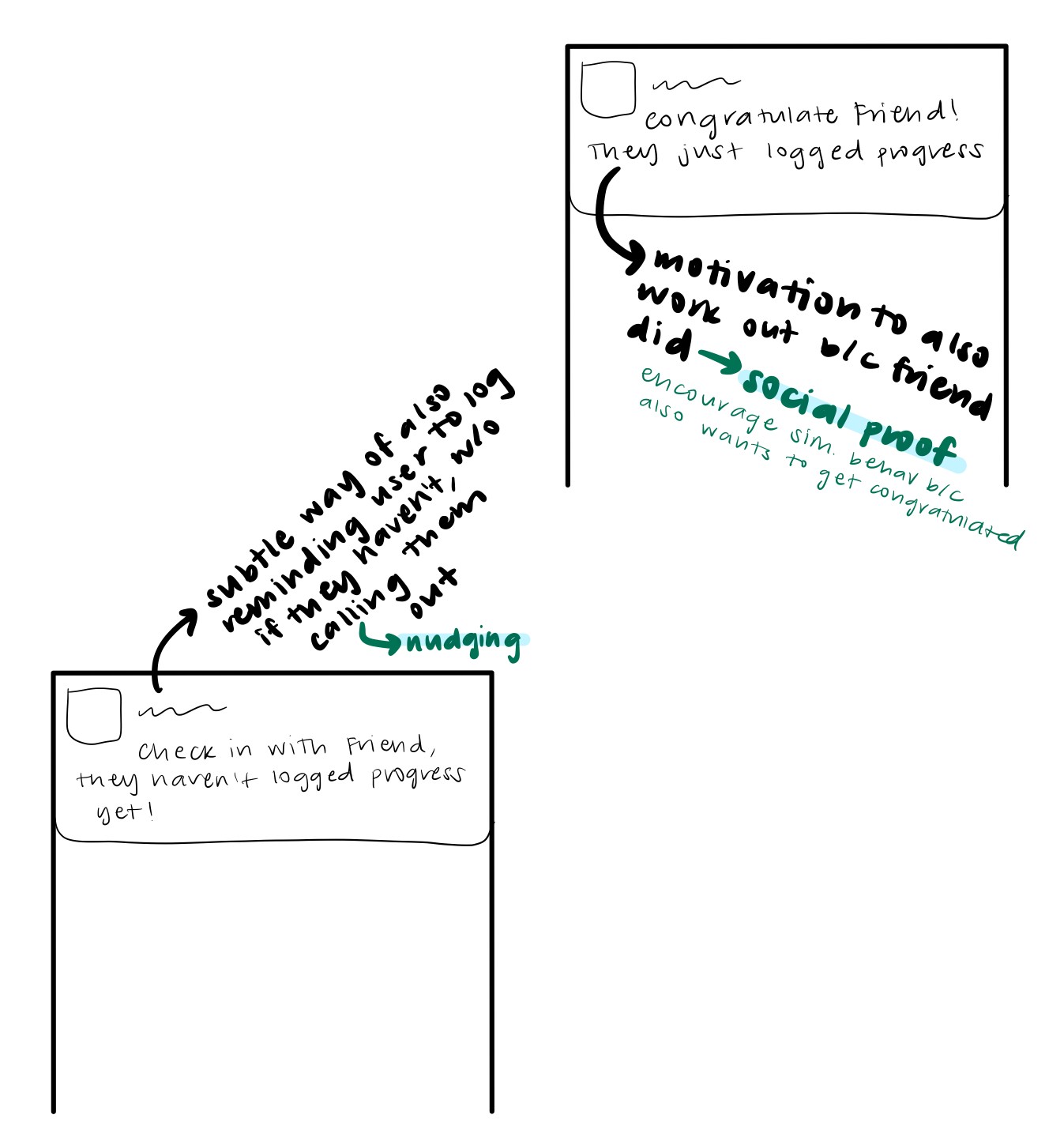
I began with loose sketches to figure out what some of the main interactions would look like before I moved to Figma. These sketches helped me start planning how to break down features and pages, as well as think through the user journey. Since one of the main user needs was motivation, I also thought about some of the notification interactions I'd want the users to experience and how that would play into features in the app. I considered how I could apply psychology concepts I had learned in class, such as social proof and nudging, to influence user behavior. After I had written out what some of these notifications might look like, and I backtracked from there to think about what features in the app would allow those notifications to be plausible interactions. I realized that a key feature was going to be a way to check in on your friends' progress, as well as a low-effort means of rewarding each one another for following through.
Testing Digital Lo-Fi Prototype
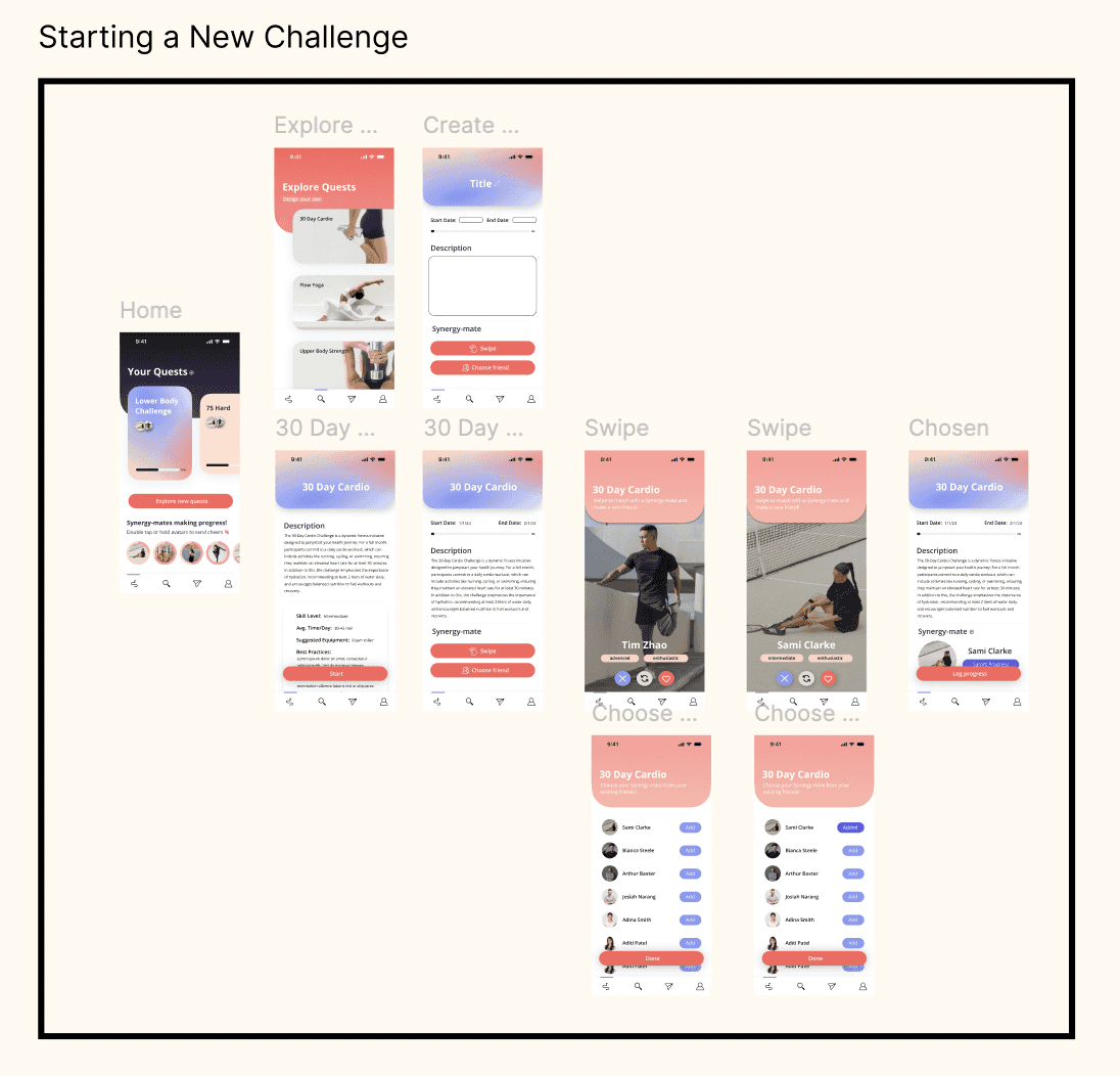
From the sketches, I created a lo-fi prototype in Figma that had 3 main features. The ability to set goals for oneself, the requirement to add accountability partners for each of those goals, and a social feature to allow those working towards the same goal to stay connected. I ran 4 user testing sessions with my lo-fi prototypes. Some of the main design changes that came out of those sessions are as follows.
Testing Mid-Fi Prototype
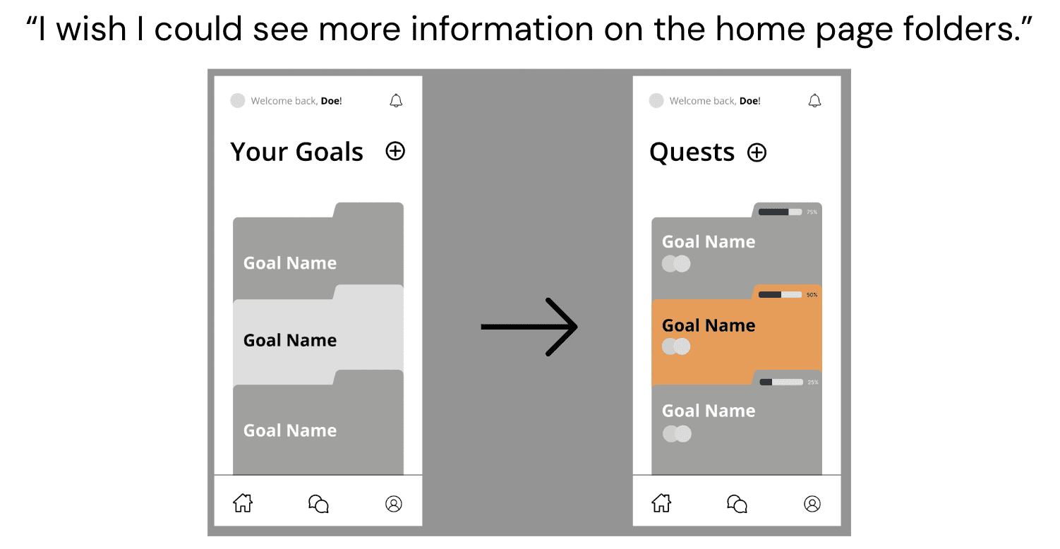
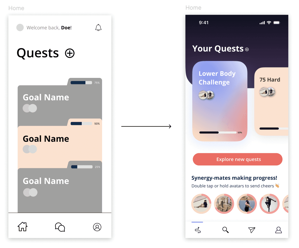
Based on these findings, I created a mid-fi prototype, on which I ran another 4 user testing sessions. The main finding here was that users expected a more "futuristic" feel from the app. The folders reminded them of early 2000's desktop folders, and they said they wouldn't want to use an app that felt dated, even if the functionality was useful. Based on this, I went for a more modern, abstract feel with the shapes and placement of each element in the hi-fi prototype.
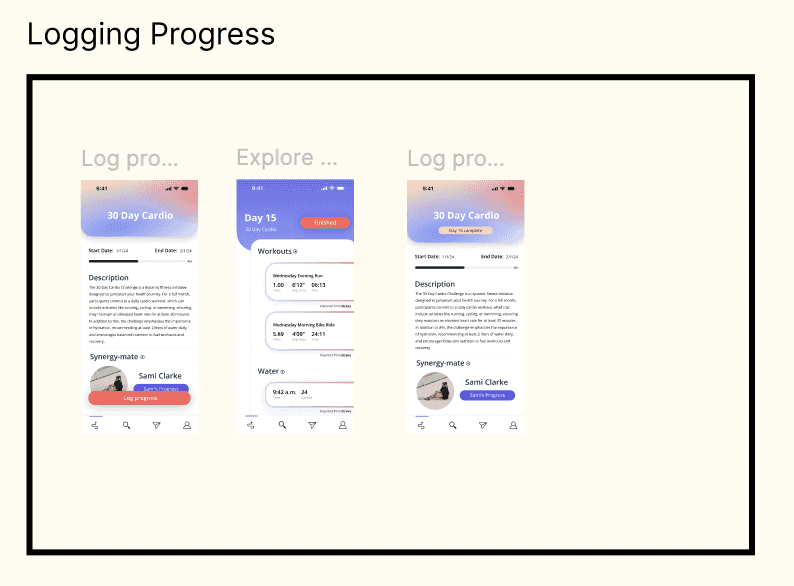
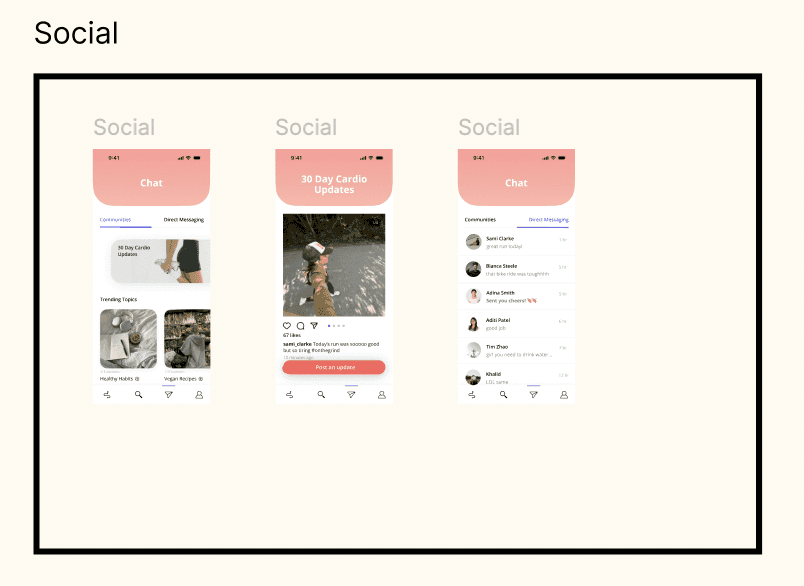
Users also mentioned that having to message their accountability partner manually to check in or acknowledge their progress was far too much effort, and 3/4 said they would likely either forget or be too lazy to check in. Since this would significantly reduce the productivity of the app and defeats its purpose, I had to think of more unique, low effort ways we could maintain those relationships. The result was the "send cheers" feature. All of a user's friends that have logged progress towards a goal that day would appear on the user's dashboard screen. To acknowledge that you are proud of them, you can just press and hold or double tap their avatar to send them "cheers," which would show up as a message notification and automatically populate in the direct message thread between the two.
Final Flows
Next Steps
APPLE WATCH INTERFACE
Create designs compatible with the smaller screen size
VOICE COMMANDS
Complete interactions in the app by speaking
compatibility research
Look into privacy policies of other apps to determine if I can expand